Fig. 4
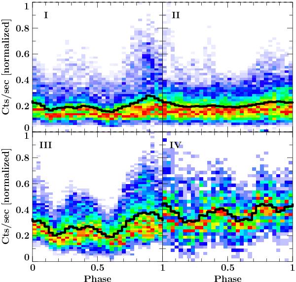
Color-coded maps of the pulse phase distribution of normalized countrates in regions I − IV as indicated in Fig. 2. See text for details. Color represents the number of measurements for each countrate in the respective phase bin. Each phase bin was normalized to itself, so that they have all comparable color-codes. Colors are ranging from violet, corresponding to zero, to red, corresponding to one. The superimposed black line shows the mean value, i.e., the pulse profile.
Current usage metrics show cumulative count of Article Views (full-text article views including HTML views, PDF and ePub downloads, according to the available data) and Abstracts Views on Vision4Press platform.
Data correspond to usage on the plateform after 2015. The current usage metrics is available 48-96 hours after online publication and is updated daily on week days.
Initial download of the metrics may take a while.