Fig. 4
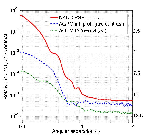
Normalized azimuthally averaged relative intensity profiles and contrast curve. The plain red curve shows the intensity profile of a typical saturated NACO L′ PSF (similar brightness and exposure time). The blue dashed curve shows the AGPM intensity profile before PCA, demonstrating the instantaneous contrast gain provided by the coronagraph at all spatial frequencies within the AO control radius ( ). The green dash-dot curve presents the reduced PCA-ADI 5σ detectability limits (40 frames, 800 s, ΔPA ≈ 30°), taking both the coronagraph off-axis transmission and the PCA-ADI flux losses into account.
Current usage metrics show cumulative count of Article Views (full-text article views including HTML views, PDF and ePub downloads, according to the available data) and Abstracts Views on Vision4Press platform.
Data correspond to usage on the plateform after 2015. The current usage metrics is available 48-96 hours after online publication and is updated daily on week days.
Initial download of the metrics may take a while.