Fig. 2
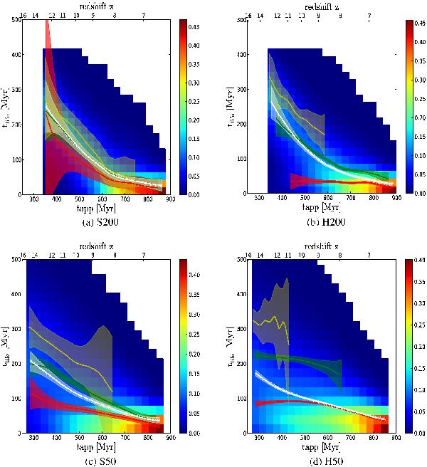
In the background we show the distribution of the lifetime of the ionized regions before their first major merger as a function of the appearance time of the regions. The color code is in arbitrary units with blue values indicating a faint probability, while the red tones denote a high probability. The white curve represents the evolution of the mean value of the whole distribution, the shaded area stands for the 3σ uncertainty on this value. The dotted white line represents the best fit of the mean value according to the fitting formula described in Appendix A. Red, green, and yellow curves represent the same evolution for three classes of inner halo mass according to Table 2 (in solar masses for H200/S200 red: 109 − 1010, green: 1010−1011, yellow: >1011, and for H50/S50 red: 108 −109, green: 109−1010, yellow: >1010.
Current usage metrics show cumulative count of Article Views (full-text article views including HTML views, PDF and ePub downloads, according to the available data) and Abstracts Views on Vision4Press platform.
Data correspond to usage on the plateform after 2015. The current usage metrics is available 48-96 hours after online publication and is updated daily on week days.
Initial download of the metrics may take a while.