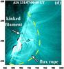
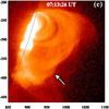
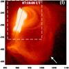
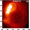
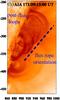
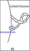
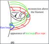
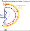
Fig. 6
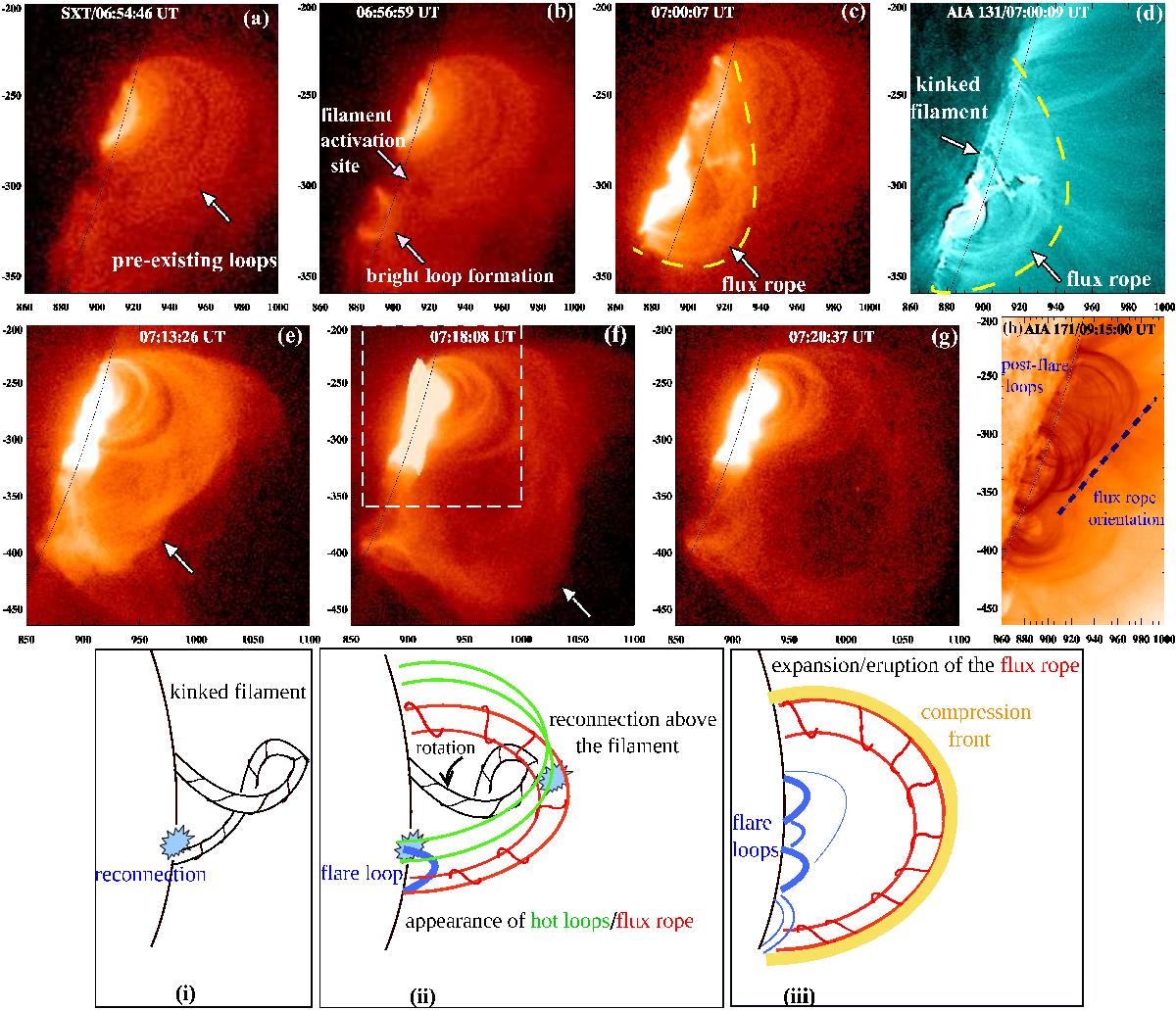
Hinode/SXT images of the eruption site showing the evolution of the flux rope during the flare. The appearance of the flux rope is shown by a yellow dotted curve c) and d). The dotted rectangular box in panel f) represents the field of view of the upper row panels. Panel g) shows the post-flare loops observed in the AIA 171 Å channel, and the orientation of the flux rope is marked by the dotted lines. Bottom: schematic cartoon showing the different stages of the eruption.
Current usage metrics show cumulative count of Article Views (full-text article views including HTML views, PDF and ePub downloads, according to the available data) and Abstracts Views on Vision4Press platform.
Data correspond to usage on the plateform after 2015. The current usage metrics is available 48-96 hours after online publication and is updated daily on week days.
Initial download of the metrics may take a while.