Fig. 13
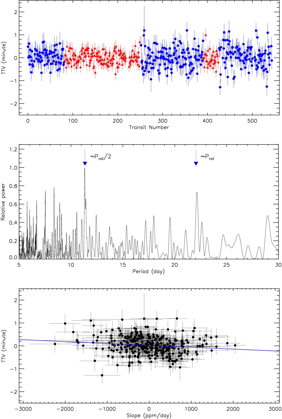
Upper panel: differences between the observed and modelled transit centre times of Kepler-423 (TTVs). Transit timing variations extracted from the short cadence data are plotted with red triangles, while long cadence TTVs are shown with blue circles. Middle panel: Lomb-Scargle periodogram of the TTV data in the 5–30 day period range. The two arrows mark the peak close to the stellar rotation period and its first harmonic. Lower panel: transit timing variation versus local transit slope. The straight blue line marks the linear fit to the data.
Current usage metrics show cumulative count of Article Views (full-text article views including HTML views, PDF and ePub downloads, according to the available data) and Abstracts Views on Vision4Press platform.
Data correspond to usage on the plateform after 2015. The current usage metrics is available 48-96 hours after online publication and is updated daily on week days.
Initial download of the metrics may take a while.