Fig. 1
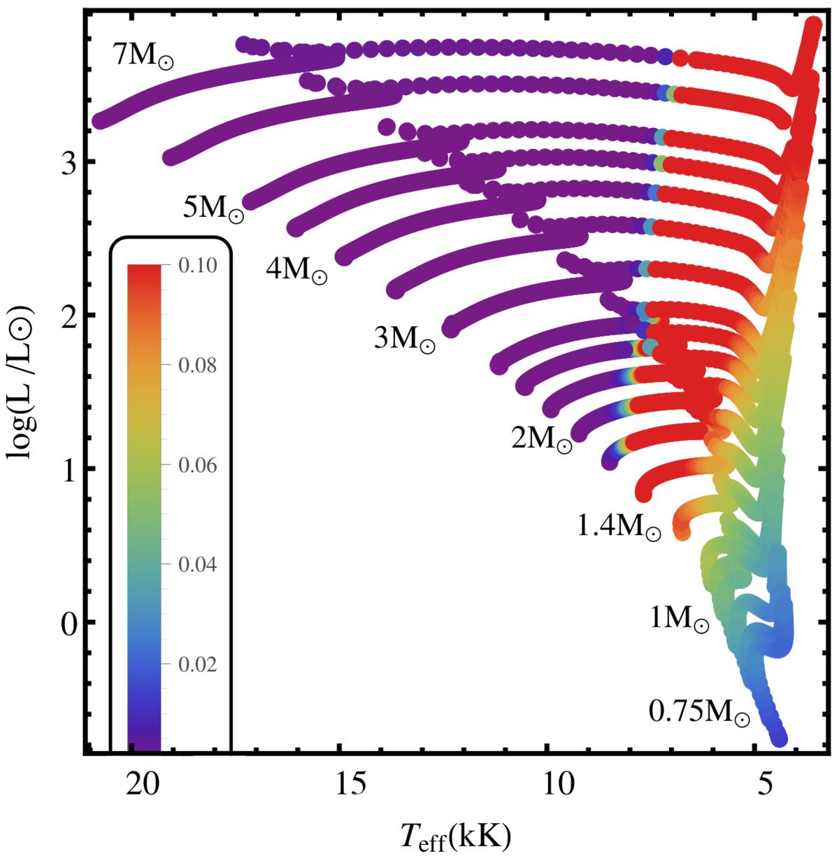
HR diagram showing the computed stellar evolution tracks. The colors of the dots indicate the maximum fraction of turbulent-to-total pressure occurring within the stellar envelopes (see framed color bar in the bottom left corner). Stellar models in red show Pturb/P> 10%. The masses of the models are indicated next to the tracks. For the upper HR diagram, see Fig. 1 in Grassitelli et al. (2015).
Current usage metrics show cumulative count of Article Views (full-text article views including HTML views, PDF and ePub downloads, according to the available data) and Abstracts Views on Vision4Press platform.
Data correspond to usage on the plateform after 2015. The current usage metrics is available 48-96 hours after online publication and is updated daily on week days.
Initial download of the metrics may take a while.