Fig. 1
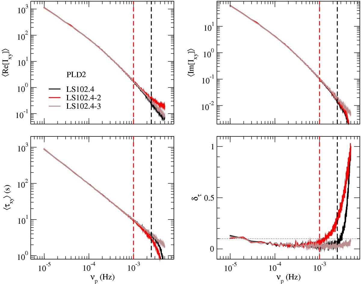
Sample mean of the real and imaginary parts of the cross-periodogram (top left and right panels, respectively), the sample mean time-lag spectrum and the relative time-lag bias (bottom left and right panel, respectively) in experiment PLD2. The vertical black and red dashed lines indicate νNyq/ 2 and νNyq/ 5, respectively. Above these frequencies, the LS102.4 (black curve) and LS102.4-2 (red curve) relative time-lag bias begins to noticeably increase (see text for more details). The horizontal dotted line in the bottom right panel, and in all subsequent ![]() plots, indicates the 0.1 (i.e. 10%) relative time-lag bias.
plots, indicates the 0.1 (i.e. 10%) relative time-lag bias.
Current usage metrics show cumulative count of Article Views (full-text article views including HTML views, PDF and ePub downloads, according to the available data) and Abstracts Views on Vision4Press platform.
Data correspond to usage on the plateform after 2015. The current usage metrics is available 48-96 hours after online publication and is updated daily on week days.
Initial download of the metrics may take a while.