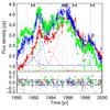
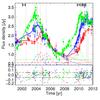
Fig. 10
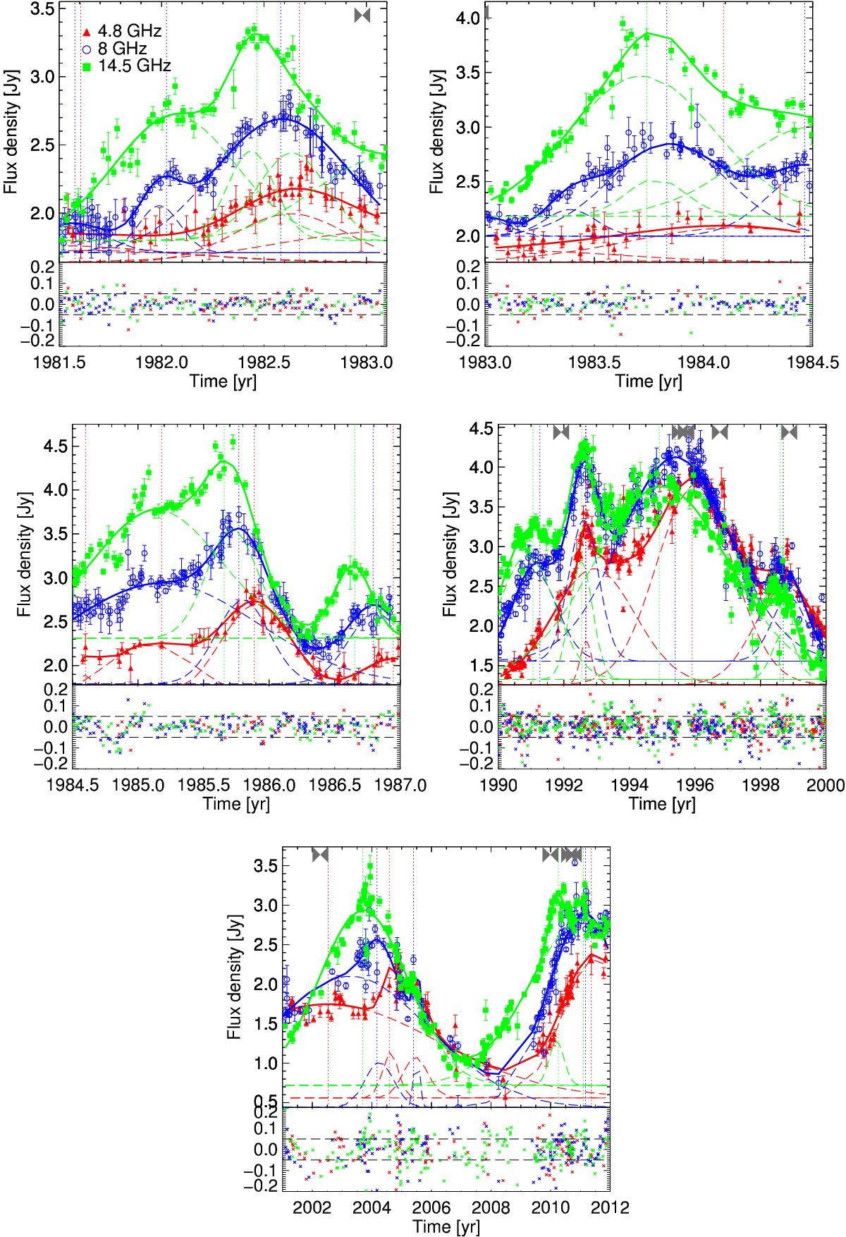
Top: total flux-density versus time at 4.8 (red triangles), 8.0 (blue circles), and 14.5 GHz (green squares). Solid curves show best-fit models for each frequency separately. Dashed curves show the individual Gaussian models that make up each best-fit model. Vertical dotted lines show the identified peaks of the light-curve based on the best-fit model. Gray bowties at the top of the plot mark the calculated ejection times of the VLBI components, based on our kinematic analysis. Bottom: residuals in fractional units (observed flux-density minus the best-fit model and normalized by the observed flux-density) as a function of time. Dashed lines denote the 5% level. Colors are as in the top panel.
Current usage metrics show cumulative count of Article Views (full-text article views including HTML views, PDF and ePub downloads, according to the available data) and Abstracts Views on Vision4Press platform.
Data correspond to usage on the plateform after 2015. The current usage metrics is available 48-96 hours after online publication and is updated daily on week days.
Initial download of the metrics may take a while.