Fig. 16
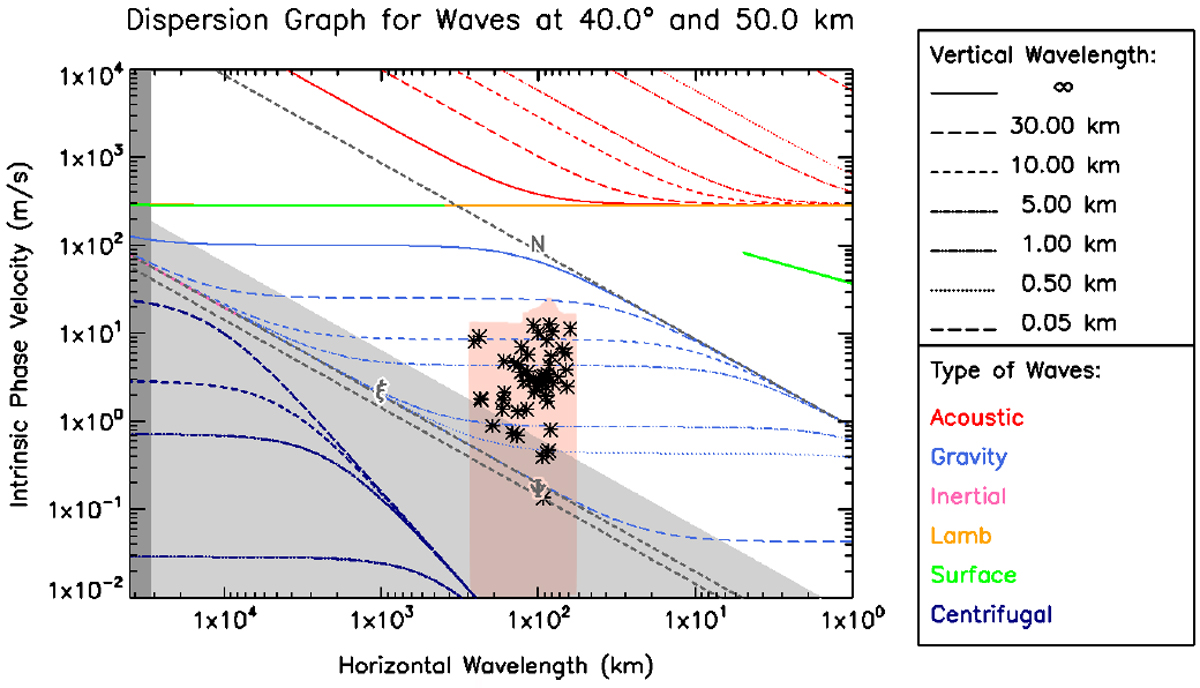
Dispersion diagram for dynamically characterised waves on both data sets. Each dashed coloured line represents the value of the vertical wavelength that a wave would have given its specific horizontal wavelength and intrinsic phase velocity values according to the models described in Peralta et al. (2014a,b). The shaded region over the data points represents the error on the phase velocity of the waves. Due to the logarithmic nature of this diagram, the error bars go all the way down towards the abscissa.
Current usage metrics show cumulative count of Article Views (full-text article views including HTML views, PDF and ePub downloads, according to the available data) and Abstracts Views on Vision4Press platform.
Data correspond to usage on the plateform after 2015. The current usage metrics is available 48-96 hours after online publication and is updated daily on week days.
Initial download of the metrics may take a while.