Fig. 6
Download original image
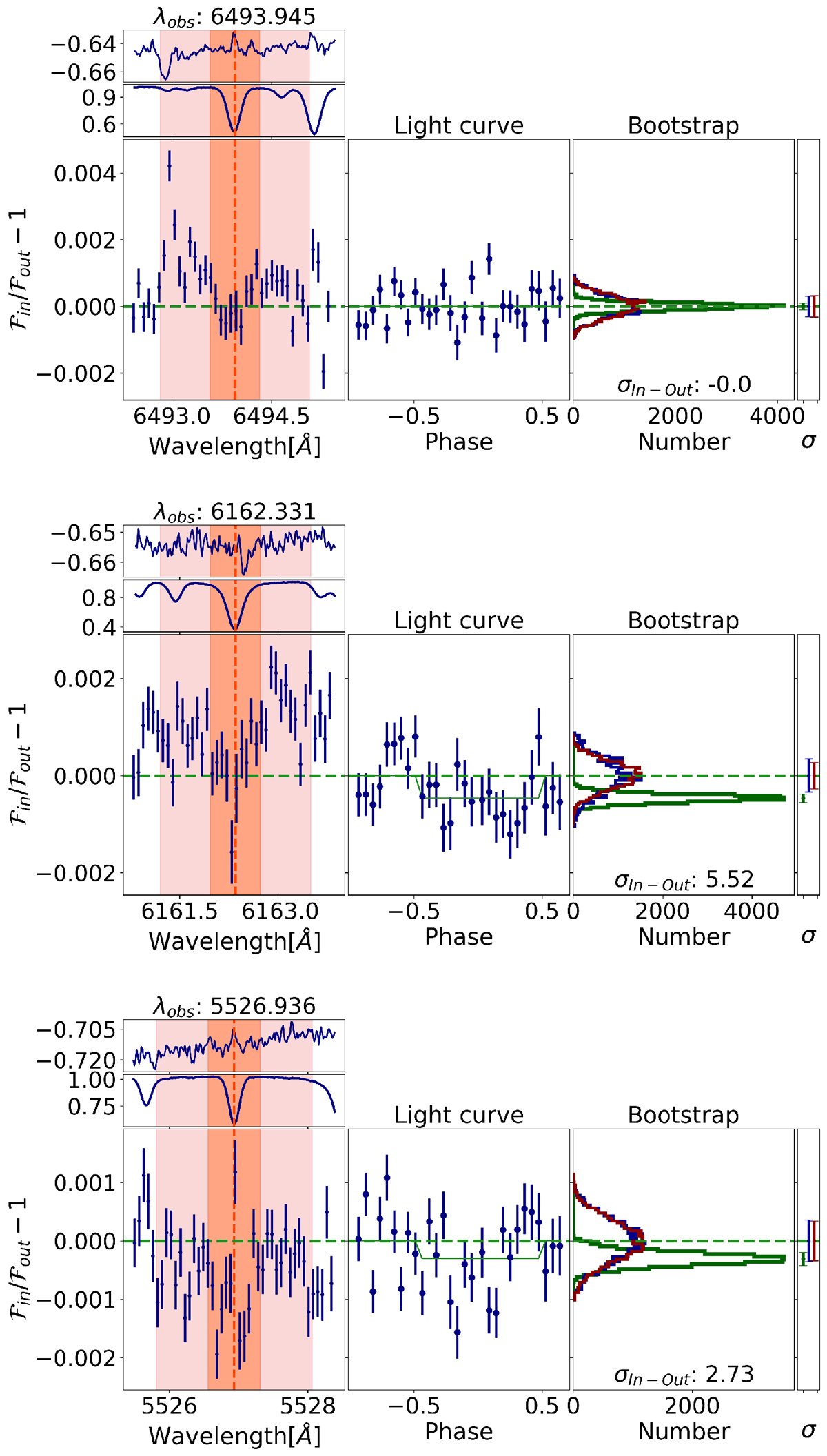
Summary plots for previously detected Calcium I (6493.8, 6162.3 Å) and Scandium II (5526.8 Å) revisited in this work. A summary plot is associated with a transition, and contains the principal outputs of the algorithm steps, in three panels. Left panel: from top to bottom, we see the telluric spectra, the normalized flux of the line, and the transit seen along wavelength, as the flux is integrated along time. Central panel: Snellen et al. (2008) transmission light curve. Right wide panel: bootstrap method plot, where we can see the distribution of the scenarios explained in Fig. 3. Green corresponds to the In-Out scenario, blue to the Out-Out scenario, and red to the In-In scenario. We can also see the widths of the histograms on the right. Right narrow panel: graphical representation of the detection significance (green bar) and the null hypothesis (blue and red bars). The green bar corresponds to the In-Out histogram width, and the blue and red correspond to the Out-Out and In-In histograms, respectively.
Current usage metrics show cumulative count of Article Views (full-text article views including HTML views, PDF and ePub downloads, according to the available data) and Abstracts Views on Vision4Press platform.
Data correspond to usage on the plateform after 2015. The current usage metrics is available 48-96 hours after online publication and is updated daily on week days.
Initial download of the metrics may take a while.