Fig. A.9.
Download original image
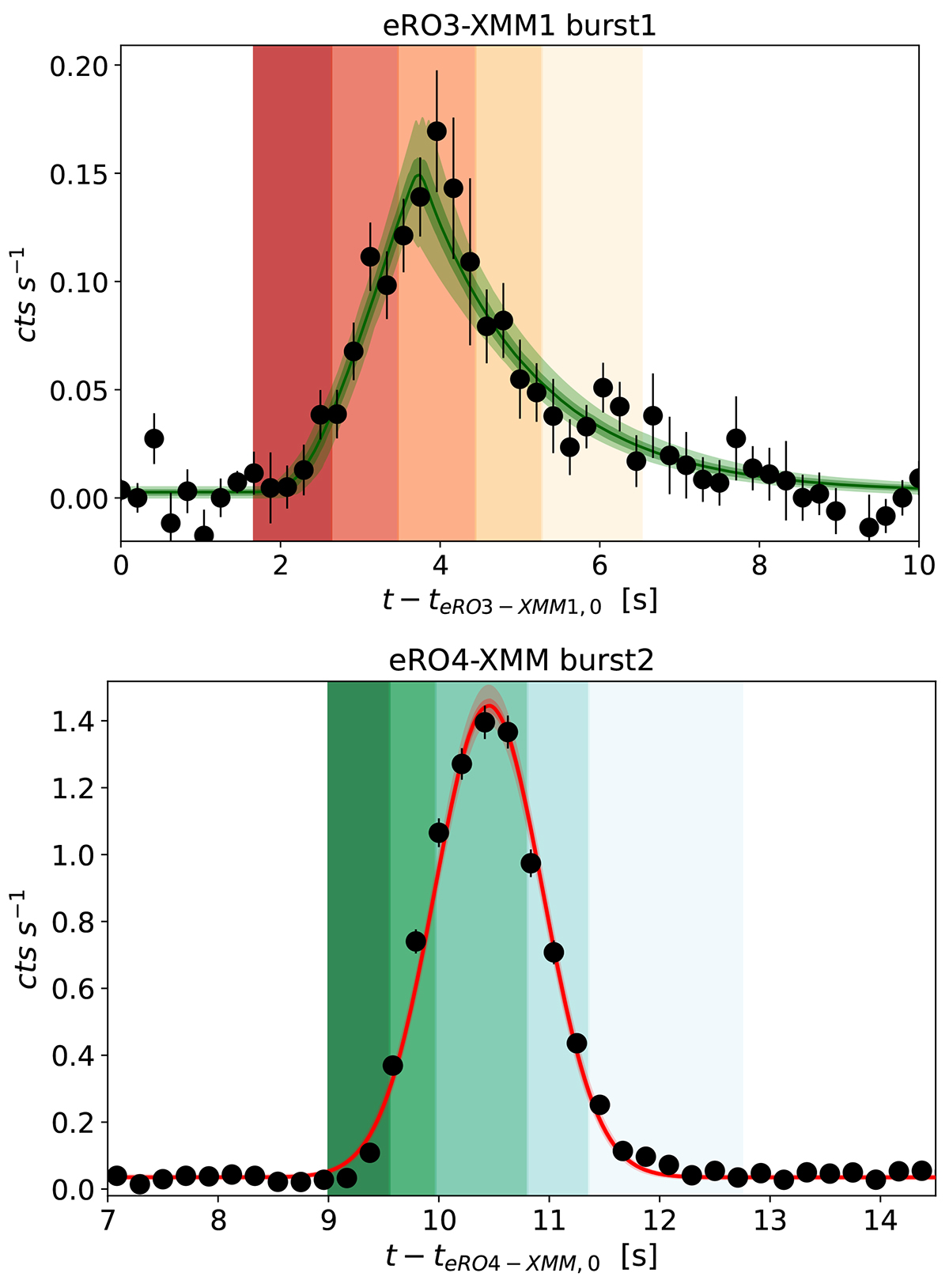
Top: a chunk of the eRO3-XMM1 observation (see Fig. 4). The best-fitting model (Eq. 1) is superimposed as a green line (median) and related percentile contours (equivalent to 1σ and 3σ). The vertical shaded areas represent the phases of the burst (namely rise1, rise2, peak, decay1, decay2, with the same color-coding as Fig. 10 for eRO-QPE3). Bottom: same as the top panel, but for the eRO4-XMM observation. The best-fitting model is here shown in red, and the phases of the burst follow the color-coding of eRO-QPE4 in Fig. 10.
Current usage metrics show cumulative count of Article Views (full-text article views including HTML views, PDF and ePub downloads, according to the available data) and Abstracts Views on Vision4Press platform.
Data correspond to usage on the plateform after 2015. The current usage metrics is available 48-96 hours after online publication and is updated daily on week days.
Initial download of the metrics may take a while.