Fig. 4.
Download original image
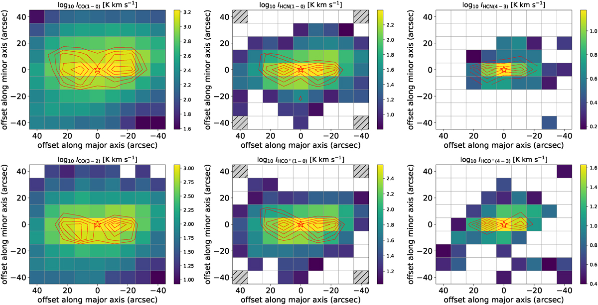
Maps of the entire area observed of various molecular-line emissions, color-coded by the velocity-integrated line intensity. Regions where the velocity-integrated line intensity is lower than 3σ are marked by blank pixels, while the typical RMS is represented by the lowest values of each map. Each panel in the figure corresponds to a different molecular line, as indicated by the title. The galaxy’s center is marked by a red star and the gray squares denote positions with no available observational data. Contours are drawn at 50%, 60%, 70%, 80%, and 90% of the maximum of the peak main-beam temperature (Tpeak) for each line.
Current usage metrics show cumulative count of Article Views (full-text article views including HTML views, PDF and ePub downloads, according to the available data) and Abstracts Views on Vision4Press platform.
Data correspond to usage on the plateform after 2015. The current usage metrics is available 48-96 hours after online publication and is updated daily on week days.
Initial download of the metrics may take a while.