Fig. 5
Download original image
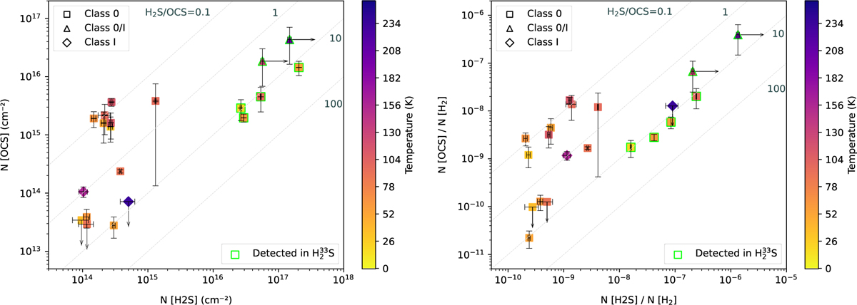
OCS versus H2S comparison in the sources where H2S was detected. The color of the markers represents bolometric temperature (side colorbar). Left: column densities. The OCS column density increases with increasing H2S column density. We see two different trends in this graph: (1) Several sources have H2S/OCS ratios around ~7–10, which we classify as OCS-poor sources. (2) The rest of the sources present H2S/OCS ratios in the ~0.1–1 range, and most of them are arranged in a cluster of several points in the {N(OCS)~2×l015cm–2, N(H2S) ~2×l014cm–2} range. They are classified as OCS-rich sources. Right: abundances. We find similarities with the first graph: The OCS abundances grow together with H2S abundances, the lower H2S/OCS ratio sources follow a linear (log) trend, and the rest are very differentiated from the fitted line. In this case, the fit corresponds to H2S/OCS ratio of 0.147±0.022.
Current usage metrics show cumulative count of Article Views (full-text article views including HTML views, PDF and ePub downloads, according to the available data) and Abstracts Views on Vision4Press platform.
Data correspond to usage on the plateform after 2015. The current usage metrics is available 48-96 hours after online publication and is updated daily on week days.
Initial download of the metrics may take a while.