Fig. 2
Download original image
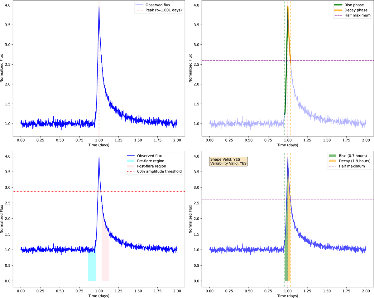
Top left: simulated flare generated using the template from Davenport et al. (2014), with the flare peak marked by a dotted red line. Top right: determination of the flare’s start and end times. Bottom left: assessment of local variability with designated baseline regions – pre-flare data (cyan) and post-flare data (pink). The horizontal dotted red line indicates the 60% amplitude threshold. Bottom right: detailed examination of the flare shape, highlighting the rise phase (green) and decay phase (orange). Key parameters including rise time, decay time, alongside the outcomes of the shape and variability checks.
Current usage metrics show cumulative count of Article Views (full-text article views including HTML views, PDF and ePub downloads, according to the available data) and Abstracts Views on Vision4Press platform.
Data correspond to usage on the plateform after 2015. The current usage metrics is available 48-96 hours after online publication and is updated daily on week days.
Initial download of the metrics may take a while.