Fig. 2.
Download original image
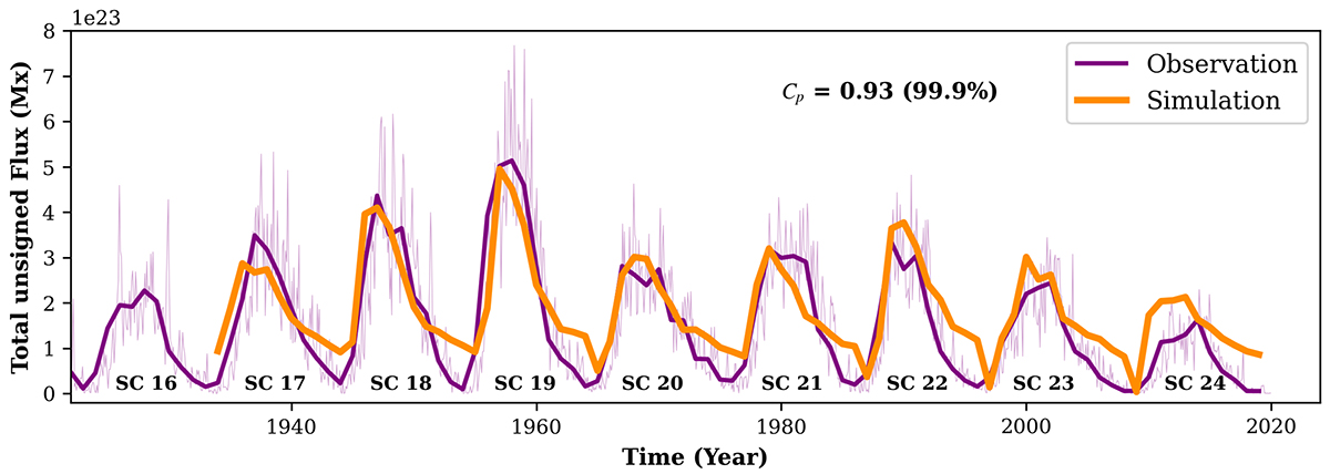
Simulated solar cycle reconstruction versus observations. The violet curve represents the total yearly averaged unsigned sunspot flux from solar cycle 16 to 24, derived from the USAF/RGO/NOAA database. The orange curve indicates the total unsigned flux simulated using the dynamo model (refer A.2), driven by the poloidal field generated by the SPhoTraM model. A Pearson correlation coefficient of 0.93, calculated with a 99% confidence level, highlights the strong agreement between the observed and simulated flux strengths at cycle maxima.
Current usage metrics show cumulative count of Article Views (full-text article views including HTML views, PDF and ePub downloads, according to the available data) and Abstracts Views on Vision4Press platform.
Data correspond to usage on the plateform after 2015. The current usage metrics is available 48-96 hours after online publication and is updated daily on week days.
Initial download of the metrics may take a while.