Fig. 7
Download original image
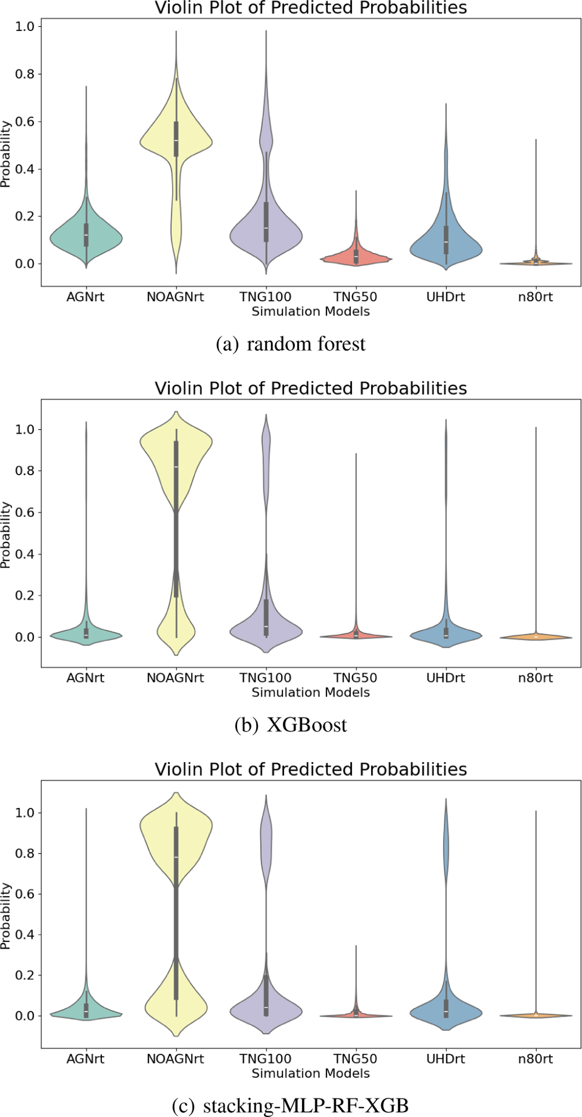
Violin plots show the classification of the in-distribution data of the SDSS test set for three classifiers. Top: random forest. Middle: XGBoost. Bottom: stacking-MLP-RF-XGB. The horizontal white line inside the box marks the median. The whole gray box shows the interquartile range (IQR), which is defined as the difference between the third quartile (Q3) and the first quartile (Q1) of a group of data. Hence it shows the middle 50% of the distribution. And the whisker is calculated as 1.5 × IQR. It displays the distribution of predicted model probabilities ![]() over all data
over all data ![]() (y-axis) for 6 simulation models (x-axis).
(y-axis) for 6 simulation models (x-axis).
Current usage metrics show cumulative count of Article Views (full-text article views including HTML views, PDF and ePub downloads, according to the available data) and Abstracts Views on Vision4Press platform.
Data correspond to usage on the plateform after 2015. The current usage metrics is available 48-96 hours after online publication and is updated daily on week days.
Initial download of the metrics may take a while.