Fig. 3.
Download original image
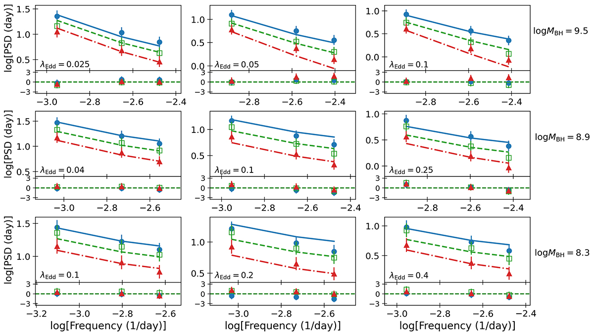
Blue circles, green squares, and red triangles indicate the observed PSDs at λ = 1300 Å, 2300 Å, 4000 Å, respectively, for all combinations of BH mass and accretion rate we considered. Solid blue lines, dashed green lines, and dash-dotted red lines indicate the best-fit models for α* = 0, in the case in which the corona is powered by the accretion process (note that, for clarity reasons, the ranges of the axes are different in each plot). Error bars indicate the combined error of the data and model. The best-fit residuals (i.e. (data-model)/error) are shown in the bottom panel of each plot (see the top panel of Fig. A.1 for the residuals at all wavelengths).
Current usage metrics show cumulative count of Article Views (full-text article views including HTML views, PDF and ePub downloads, according to the available data) and Abstracts Views on Vision4Press platform.
Data correspond to usage on the plateform after 2015. The current usage metrics is available 48-96 hours after online publication and is updated daily on week days.
Initial download of the metrics may take a while.