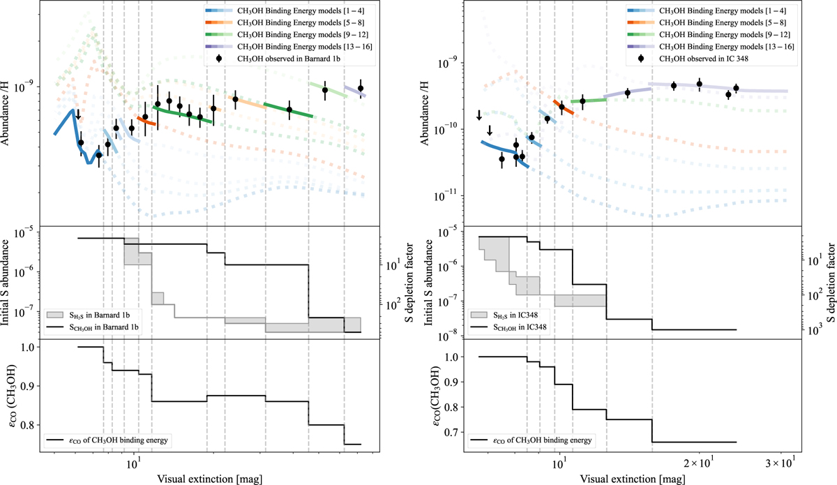
Fig. 14
Download original image
Comparison between the observed abundance of CH3 OH (black dots) in Barnard 1b (left) and IC 348 (right) with chemical models. There are three panels on each side, with one target per side. In the top panels, the comparison between the observed gas-phase abundance of CH3 OH and chemical models is made. Each solid segment, delimited by vertical dashed lines, represents the predicted abundance of a model that fits the observed methanol abundance; the color indicates the set of binding energies of that model. The initial sulfur abundance of that model is displayed in the middle panels with the black solid curve SCH3OH. The filled area SH2S from Figs. 12 and 13 is also shown for comparison. Finally, the scaling applied to the binding energy of CH3OH in each segment is depicted in the bottom panel of each column.
Current usage metrics show cumulative count of Article Views (full-text article views including HTML views, PDF and ePub downloads, according to the available data) and Abstracts Views on Vision4Press platform.
Data correspond to usage on the plateform after 2015. The current usage metrics is available 48-96 hours after online publication and is updated daily on week days.
Initial download of the metrics may take a while.