Fig. 7
Download original image
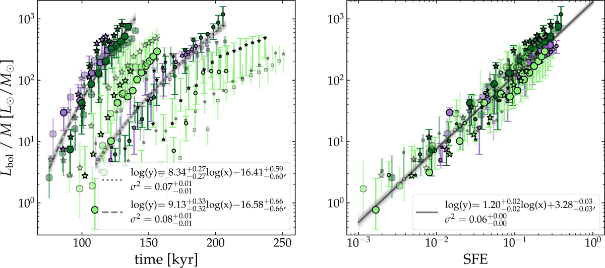
Left panel: L/M vs. time plot, which shows for each initial clump mass a clear separation between the realizations with μ = 3 (in light green) and the ones with other values of μ = 10, 100 (in dark green and purple, respectively). The latter are then fitted to a log-linear function whose best fits are represented by the back lines for two initial masses. The different setups of each model are color-coded as in Fig. 5. Right panel: L/M vs. SFE. This relation is independent from the initial clump mass. The black line represents the best fit including all the models described in this work. As for the results in Fig. 6, for small values of L/M the estimates are less accurate due to the uncertainties in the mass estimation, but the theoretical and observed values converge as the clumps evolve.
Current usage metrics show cumulative count of Article Views (full-text article views including HTML views, PDF and ePub downloads, according to the available data) and Abstracts Views on Vision4Press platform.
Data correspond to usage on the plateform after 2015. The current usage metrics is available 48-96 hours after online publication and is updated daily on week days.
Initial download of the metrics may take a while.