Fig. 2
Download original image
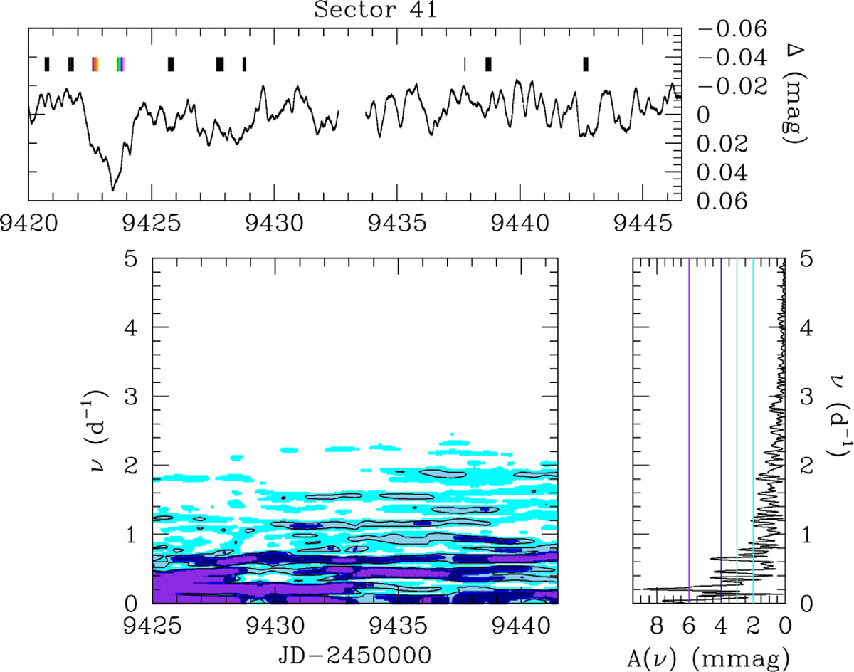
Time–frequency diagram of Sector 41 TESS data of HD 192639. The top panel displays the TESS light curve. The bottom left-hand panel illustrates the evolution of the Fourier periodogram, with the date corresponding to the middle of the 10 d sliding window. The violet, dark blue, light blue, and cyan colours, respectively, represent areas with amplitudes ≥6, ≥4, ≥3, and ≥2mmag. The bottom right panel provides the Fourier periodogram evaluated over the full light curve of Sector 41. The various coloured lines correspond to the colour-scale used in the bottom left panel. The tick marks in the top panel indicate the times of our TIGRE observations. Those in colours correspond to the trough event.
Current usage metrics show cumulative count of Article Views (full-text article views including HTML views, PDF and ePub downloads, according to the available data) and Abstracts Views on Vision4Press platform.
Data correspond to usage on the plateform after 2015. The current usage metrics is available 48-96 hours after online publication and is updated daily on week days.
Initial download of the metrics may take a while.