Fig. 2.
Download original image
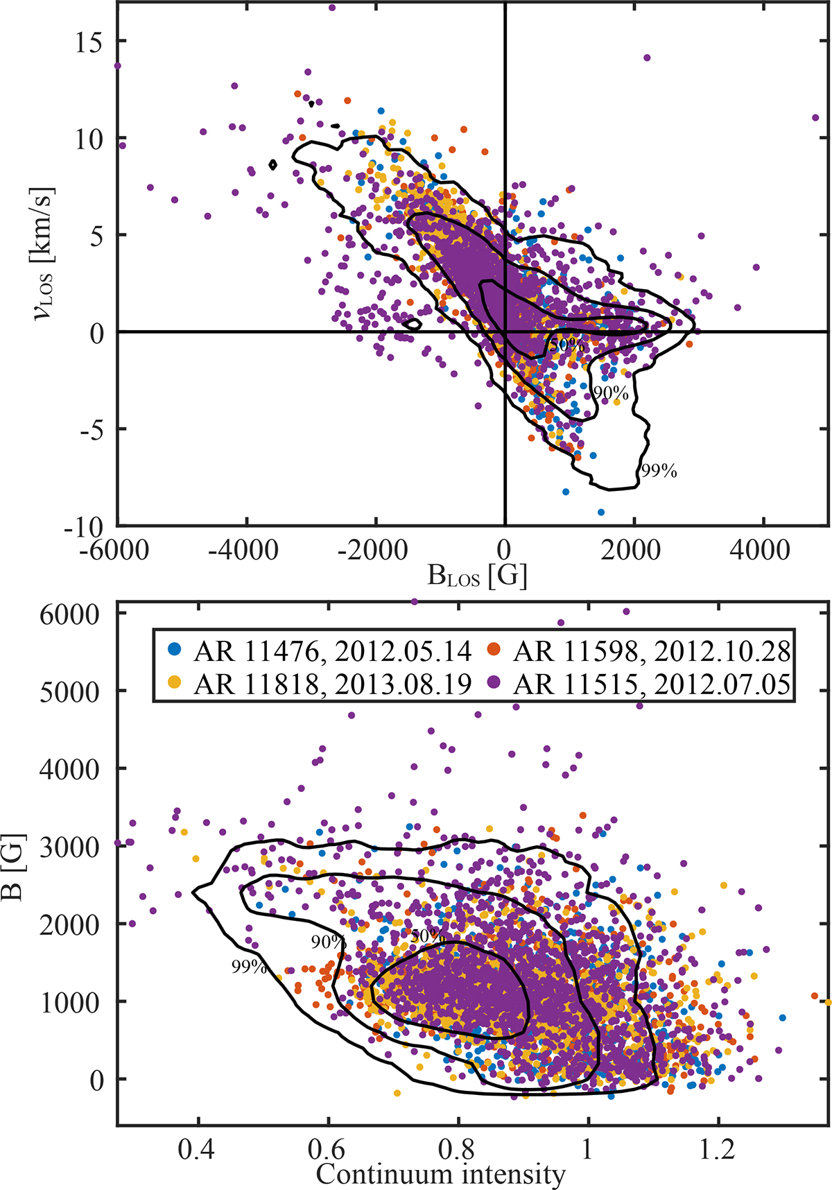
Scatter plots between different observables for various OPUs and comparison with the penumbra of a sunspot. Top: Scatter plot between vLOS and BLOS. Bottom:B vs. Ic. The different colours correspond to the individual OPUs shown in Fig. 1 (indicated by the red contours in that figure). The black contours represent the 2D kernel density estimates of the respective observables for the penumbra of the sunspot shown in the rightmost column of Fig. 1, with 99%, 90%, and 50% of the distribution being within the respective contours. We adjusted the BLOS polarity associated with the heads of filaments to be positive in the individual OPUs for a better comparison. The scatter plot in the top panel only includes pixels in which B > 500 G to exclude surrounding patches of plage.
Current usage metrics show cumulative count of Article Views (full-text article views including HTML views, PDF and ePub downloads, according to the available data) and Abstracts Views on Vision4Press platform.
Data correspond to usage on the plateform after 2015. The current usage metrics is available 48-96 hours after online publication and is updated daily on week days.
Initial download of the metrics may take a while.