Fig. 4.
Download original image
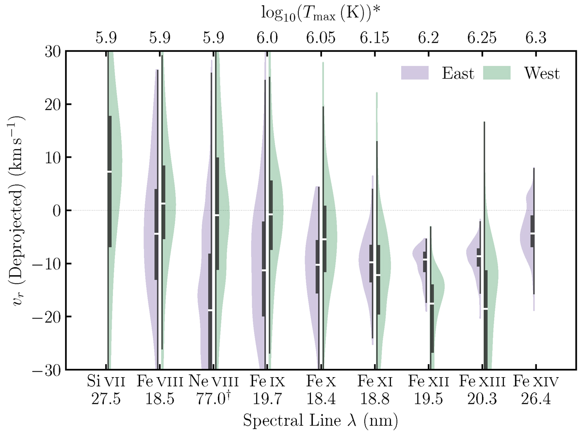
Violin plot comparing the kernel density distribution (KDE) of the deprojected Doppler shifts retrieved from the eastern (purple) and western (green) upflow regions outlined in Figure 3. Negative values represent blueshifts, while positive values stand for redshifts. The spectral lines are ordered by their formation temperatures. The thick black bars indicate the interquartile ranges, and the white dots represent the median of the distribution. *The maximum formation temperatures Tmax of spectral lines calculated by an AR DEM derived using Vernazza & Reeves (1978) composite AR spectra. †Ne VIII Doppler shifts were measured by SPICE without additional corrections. Link to the Jupyter notebook creating this figure: 📘.
Current usage metrics show cumulative count of Article Views (full-text article views including HTML views, PDF and ePub downloads, according to the available data) and Abstracts Views on Vision4Press platform.
Data correspond to usage on the plateform after 2015. The current usage metrics is available 48-96 hours after online publication and is updated daily on week days.
Initial download of the metrics may take a while.