Fig. 3.
Download original image
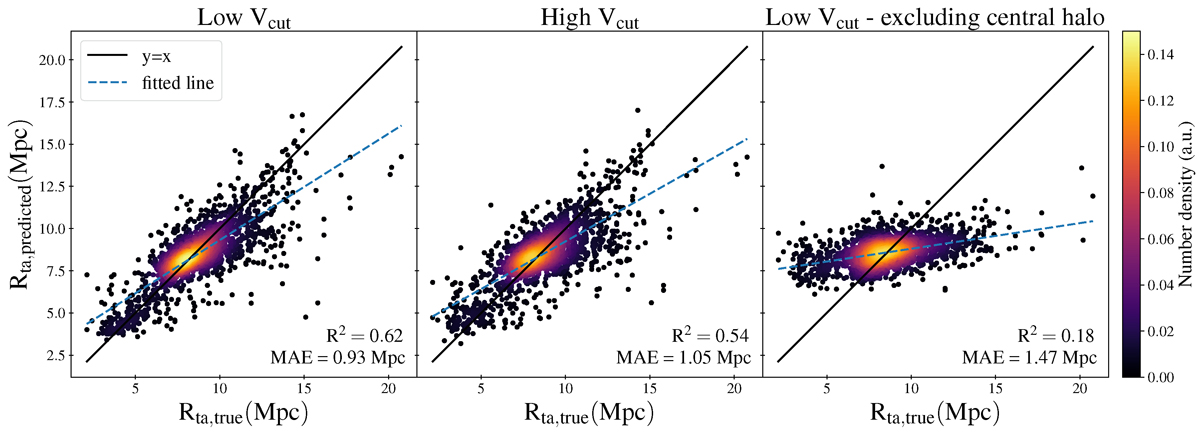
Comparison between predicted and true values of Rta for models using the MDPL2 “mass” images from: the low-velocity-cut data (left panel); the high-velocity-cut data (middle panel); and the low-velocity-cut data after removing the central halo of each projection (right panel). The colors represent the number density of the plotted points, calculated using a Gaussian kernel density estimate. R2 scores and the mean absolute errors (MAEs) are shown at the bottom right of each plot. While the models in the left and middle panel show some correlation between true and predicted Rta values, the right-panel model appears to mostly predict the mean value of the Rta distribution, especially when comparing the MAEs with the standard deviation of the Rta distribution (2.2 Mpc) as shown in the upper panel of Fig. 1.
Current usage metrics show cumulative count of Article Views (full-text article views including HTML views, PDF and ePub downloads, according to the available data) and Abstracts Views on Vision4Press platform.
Data correspond to usage on the plateform after 2015. The current usage metrics is available 48-96 hours after online publication and is updated daily on week days.
Initial download of the metrics may take a while.