Open Access
Fig. C.3
Download original image
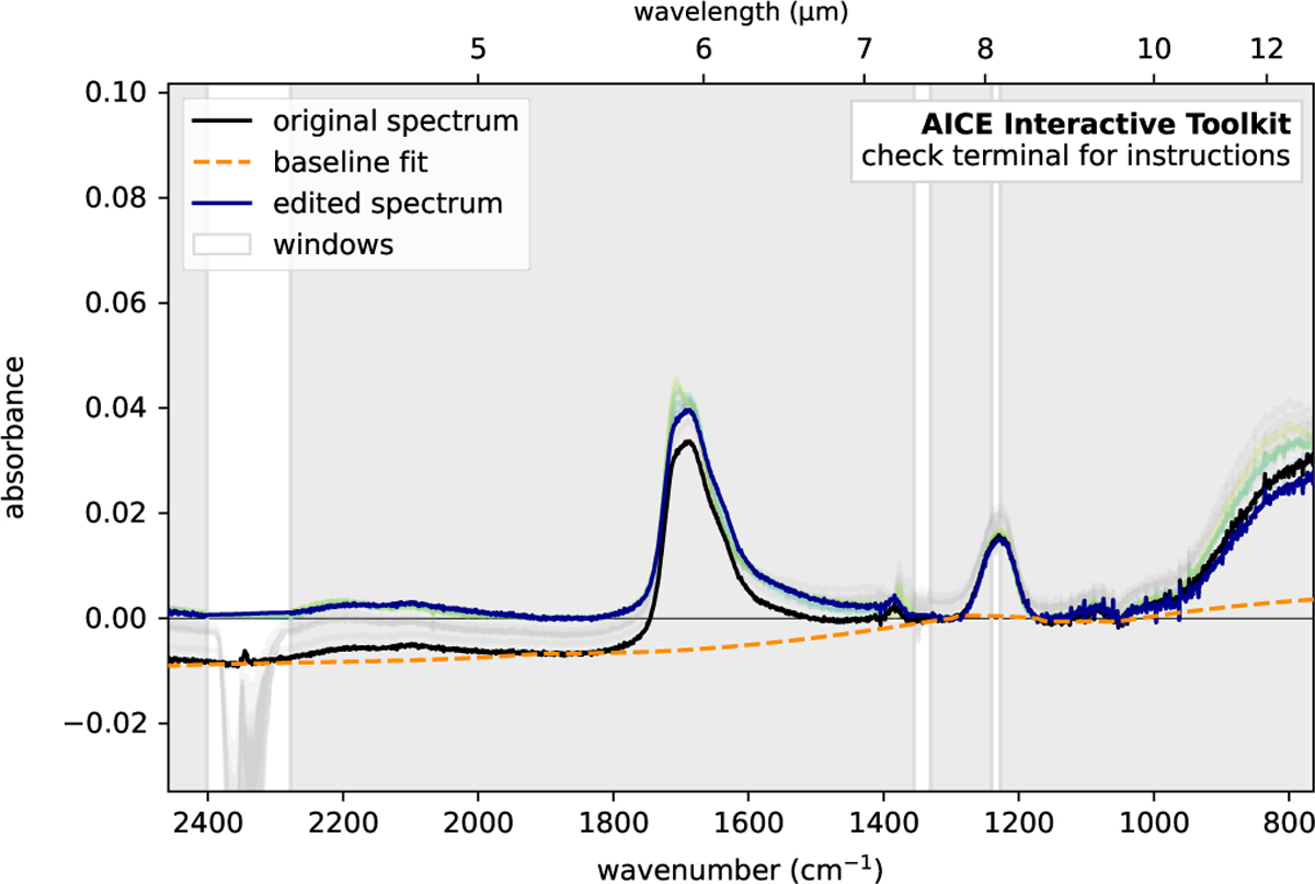
Same as Fig. C.2 in a zoomed region, after a smoothing the spectra with a size of 7 and interpolating two contaminated regions. The curve in black shows the original spectrum at 15 K, the curve in blue shows the reduced spectrum also at 15 K, and the dashed curve in orange is the fitted baseline.
Current usage metrics show cumulative count of Article Views (full-text article views including HTML views, PDF and ePub downloads, according to the available data) and Abstracts Views on Vision4Press platform.
Data correspond to usage on the plateform after 2015. The current usage metrics is available 48-96 hours after online publication and is updated daily on week days.
Initial download of the metrics may take a while.