Fig. 11
Download original image
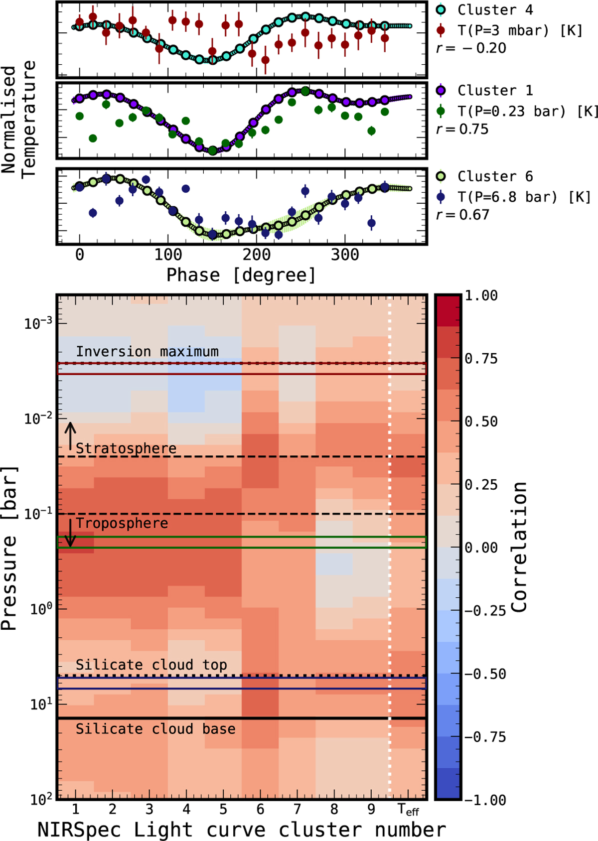
Correlation between the phase-variation of the temperature profile and the clustered light curves from M25. Top: example temperaturevariation curves drawn from three representative pressure levels in the atmosphere (highlighted boxes) compared to correlated or anticorrelated light curve clusters. Bottom: correlation coefficient between the temperature-variation at that pressure and the clustered light curves for each pressure level, as well as the correlation to the effective temperature in the right-most column. The pressure levels for the temperature curves in the top panels are highlighted with coloured boxes. Horizontal lines and annotations indicate the location of atmospheric features.
Current usage metrics show cumulative count of Article Views (full-text article views including HTML views, PDF and ePub downloads, according to the available data) and Abstracts Views on Vision4Press platform.
Data correspond to usage on the plateform after 2015. The current usage metrics is available 48-96 hours after online publication and is updated daily on week days.
Initial download of the metrics may take a while.