Fig. 5.
Download original image
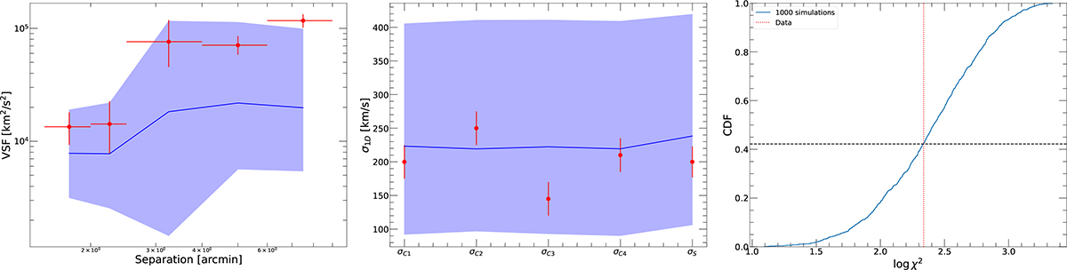
Goodness-of-fit tests applied to the Coma cluster XRISM/Resolve data. The left and middle panels show the comparison between the Resolve data (red data points) and the best fitting model for the VSF (left) and the velocity dispersion measurements in the four quadrants of the central pointings and the full southern pointing (middle). The blue curves represent the median of 1000 simulations generated from the posterior distribution, whereas the blue shaded areas show the 16th to 84th percentiles of the generated mock datasets. The right-hand panel shows the cumulative distribution of test statistic value (Eq. 11) for 1000 simulations generated from the posterior, with the test statistic value obtained for the data indicated as the dotted vertical line. The dashed black line indicates the fraction of simulations with a better test statistic value than the one obtained for the data.
Current usage metrics show cumulative count of Article Views (full-text article views including HTML views, PDF and ePub downloads, according to the available data) and Abstracts Views on Vision4Press platform.
Data correspond to usage on the plateform after 2015. The current usage metrics is available 48-96 hours after online publication and is updated daily on week days.
Initial download of the metrics may take a while.