Fig. 6
Download original image
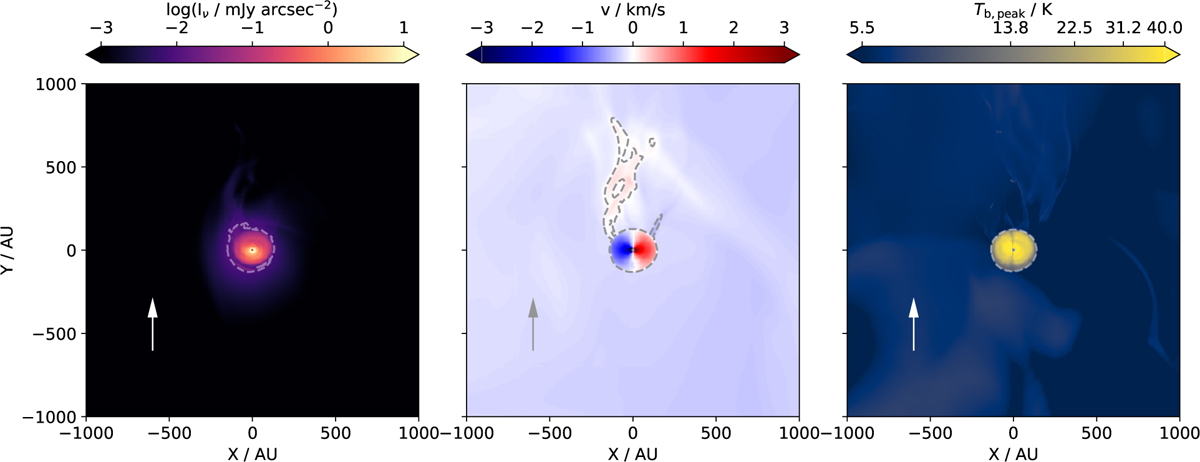
Synthetic observations of simulation number 1 in Table 1. The left panel shows the polarized scattered light intensity, as in Fig. 2, but at an inclination of i = 30°. The middle and right panels show the CO emission moment 1 and peak brightness temperature maps, as in Fig. 3, but with i = 30°. The peak brightness temperature values are mapped to colors on a square root scale. Here, the gray dashed line is the 190 mJy arcsec−2 km s−1 moment 0 contour. The white dashed line represents the 0.01 mJy arcsec−2 contour line in the left panel, and the 9K contour line in the right panel. The gray and white arrows represent the systemic inflow direction.
Current usage metrics show cumulative count of Article Views (full-text article views including HTML views, PDF and ePub downloads, according to the available data) and Abstracts Views on Vision4Press platform.
Data correspond to usage on the plateform after 2015. The current usage metrics is available 48-96 hours after online publication and is updated daily on week days.
Initial download of the metrics may take a while.