Fig. 5
Download original image
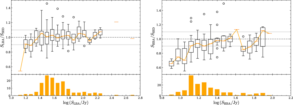
Left: statistics of flux density accuracy of sources in the 3C sample. The box plot in the upper panel shows the distribution with deviations from the expectation according to the SEDs over a range of fluxes. The “box” in the box plot denotes that the middle 50% of fluxes fall within this range, while the lower and upper 25% of fluxes fall within the error bars extending from it. The circles outside the boxes are outliers. The orange lines denote the weighted average of all the fluxes in that flux bin. Right: same as the left panel but for the measurements from LoTSS. Note how the average flux seems to be systematically underestimated by about 5% where the statistics are best.
Current usage metrics show cumulative count of Article Views (full-text article views including HTML views, PDF and ePub downloads, according to the available data) and Abstracts Views on Vision4Press platform.
Data correspond to usage on the plateform after 2015. The current usage metrics is available 48-96 hours after online publication and is updated daily on week days.
Initial download of the metrics may take a while.