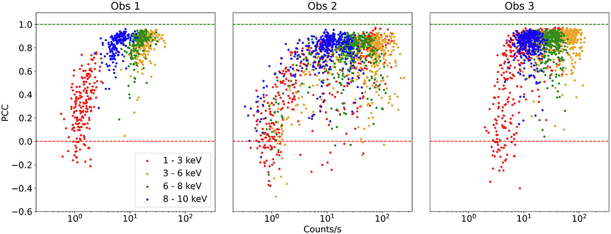
Fig. 10.
Download original image
PCC (obtained with Eq. 4) between the Rlc and the Slc per pulse cycle, plotted against the mean count rate (in logarithmic scale) of the corresponding pulse cycle. The colors represent different energy bands following the legend in the plot. Error bars are not shown for a clearer visualization of the scatter of individual points. The green and red lines mark the interval between perfect correlation and no correlation.
Current usage metrics show cumulative count of Article Views (full-text article views including HTML views, PDF and ePub downloads, according to the available data) and Abstracts Views on Vision4Press platform.
Data correspond to usage on the plateform after 2015. The current usage metrics is available 48-96 hours after online publication and is updated daily on week days.
Initial download of the metrics may take a while.