Fig. 7.
Download original image
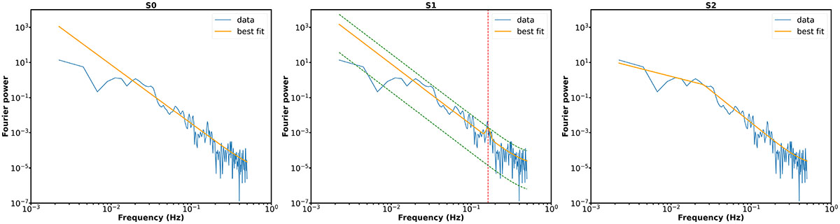
Example of AFINO results applied to the integrated light curve of the EUV brightening shown in Fig. 6 a. The blue line represents the Fourier power of the light curve, while the orange line indicates the best fit for each model: S0 (left), S1 (centre), and S2 (right). The red vertical dashed line in Model S1 marks the Gaussian centre corresponding to the dominant period, and the green dashed lines represent the 95% confidence interval. The BIC differences are ΔBICS0 − S1 = −1.1 and ΔBICS2 − S1 = −15.3. Model S2 provides the best fit to the Fourier power.
Current usage metrics show cumulative count of Article Views (full-text article views including HTML views, PDF and ePub downloads, according to the available data) and Abstracts Views on Vision4Press platform.
Data correspond to usage on the plateform after 2015. The current usage metrics is available 48-96 hours after online publication and is updated daily on week days.
Initial download of the metrics may take a while.