Fig. 14.
Download original image
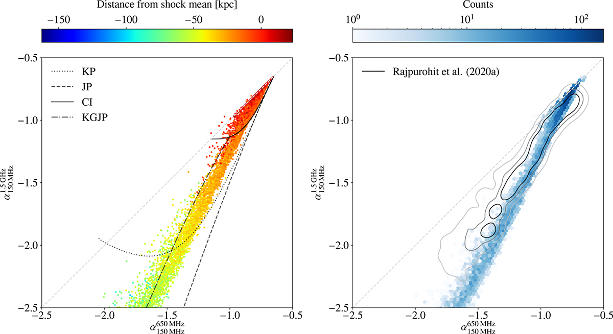
Left: Colour-colour diagram created from our fiducial Mach 3 simulation at t = 180 Myr using spectral indices between 1.5 GHz and 150 MHz, and 650 MHz and 150 MHz, respectively. Points are coloured based on their distance to the shock median. The diagonal grey line indicates zero spectral curvature. The remaining curves indicate spectral cooling models fitted to the B1 region of the Toothbrush radio relic by Rajpurohit et al. (2020a, see text for details). All models begin at ![]() . Right: As previous, but points have been binned over such that colour now represents the phase space density. Contours show the analogous data observed for the B1 region by Rajpurohit et al. (2020a) and contain 50%, 75%, and 95% of the scatter points from their figure 10 (represented by darker to lighter shades, respectively). Data from the simulation contradict traditional cooling models but are in rough agreement with the observed colour-colour diagram for a real radio relic.
. Right: As previous, but points have been binned over such that colour now represents the phase space density. Contours show the analogous data observed for the B1 region by Rajpurohit et al. (2020a) and contain 50%, 75%, and 95% of the scatter points from their figure 10 (represented by darker to lighter shades, respectively). Data from the simulation contradict traditional cooling models but are in rough agreement with the observed colour-colour diagram for a real radio relic.
Current usage metrics show cumulative count of Article Views (full-text article views including HTML views, PDF and ePub downloads, according to the available data) and Abstracts Views on Vision4Press platform.
Data correspond to usage on the plateform after 2015. The current usage metrics is available 48-96 hours after online publication and is updated daily on week days.
Initial download of the metrics may take a while.