Fig. 7.
Download original image
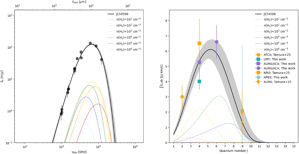
Results from the TUNER model for the observed dust SED and velocity-integrated CO line flux densities. The 50th percentile is shown by a dashed black line and the 16–84th percentile range is shown as a grey shaded area. The different dashed, colour-coded curves denote the representative contributions to the observed line and continuum SEDs from gas at specific molecular gas densities. We sampled the density grid using 50 bins, but we only plot a subset of representative density components (coloured lines) to highlight their relative contribution. These densities correspond to log(n(H2)) = 1 (red), 2 (orange), 3 (yellow), 4 (green), 5 (dark blue), and 6 (light blue) cm−3, as determined by sampling the lognormal probability distribution function of the mean H2 density. For the CO SED (right panel), contributions are scaled up by a factor of five for visibility. All observed data are shown as colour-coded symbols.
Current usage metrics show cumulative count of Article Views (full-text article views including HTML views, PDF and ePub downloads, according to the available data) and Abstracts Views on Vision4Press platform.
Data correspond to usage on the plateform after 2015. The current usage metrics is available 48-96 hours after online publication and is updated daily on week days.
Initial download of the metrics may take a while.