Fig. 5
Download original image
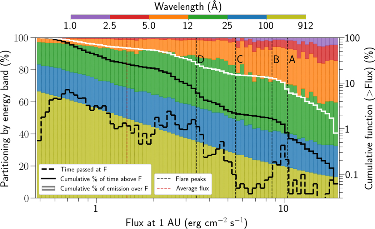
Statistical properties of Proxima Centauri flux at 1 AU, binned by total flux level. The x-axis shows the flux of the star at 1 AU (integrated from 1 to 920 Å). The flux is logarithmically binned. The right-hand-side y-axis refers to the three bold black and white lines. The three lines share this axis because all quantities are expressed as percentages. The dashed black line represents the percentage of time Prox Cen is emitting at the corresponding x-axis flux bin. The continuous black line is the cumulative curve of the dashed black line. It is showing the percentage of time the star is emitting above the corresponding x-axis flux value. The continuous white line corresponds to the percentage of the total emitted energy of Prox Cen above the corresponding flux value. The vertical dashed black lines indicate important relative maxima in the observations, excluding the absolute maximum, which would have been plotted at the extreme right. From right to left, in order from the most to the least intense, they refer to: the secondary peak of the main flare of observation 0049350101 (A), the peak of the main flare of observation 0551120401 (B), the maximum of observation 0801880301 (C), and the peak at the start of observation 0049350101 (D). The vertical dashed red line is the average flux over all the observations. The left-hand-side y-axis describes the partitioning by wavelength range of each flux bin. They are color-coded by the top color bar. This partitioning is obtained by averaging all spectra in the corresponding flux bin.
Current usage metrics show cumulative count of Article Views (full-text article views including HTML views, PDF and ePub downloads, according to the available data) and Abstracts Views on Vision4Press platform.
Data correspond to usage on the plateform after 2015. The current usage metrics is available 48-96 hours after online publication and is updated daily on week days.
Initial download of the metrics may take a while.