Fig. 3
Download original image
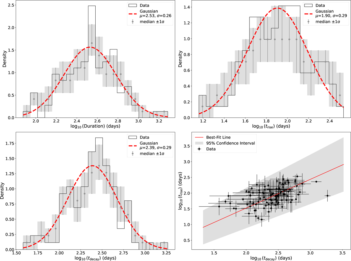
Distributions of the durations, rise times, and decay times of the flares (top panels and bottom-left panel, respectively), as well as the scatter plot of trise versus tdecay (bottom-right panel). The red dashed lines indicate Gaussian distributions overplotted on the data. The grey data points and boxes represent the median of the generated distributions for each bin and corresponding uncertainty, respectively. In the bottom-right panel the solid red line indicates the best-fit ODR line, while the grey contour represents the 95% confidence interval.
Current usage metrics show cumulative count of Article Views (full-text article views including HTML views, PDF and ePub downloads, according to the available data) and Abstracts Views on Vision4Press platform.
Data correspond to usage on the plateform after 2015. The current usage metrics is available 48-96 hours after online publication and is updated daily on week days.
Initial download of the metrics may take a while.