Fig. D.4.
Download original image
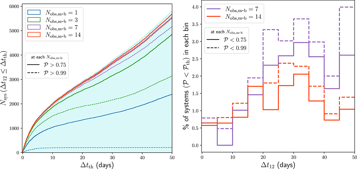
Distribution of the time delay between the first and second arriving images (Δt12) for mock lensed systems. The left panel shows the cumulative distribution, i.e., the number of systems with Δt12 smaller than a threshold Δtth, plotted along the x-axis. The filled cyan histogram represents the full test sample of 5,811 systems. Blue, green, purple, and red curves correspond to the distributions after the 1st, 3rd, 7th, and 14th observations, respectively. For these curves, solid and dashed line-styles indicate the subsets with scores 𝒫 > 0.75 and 𝒫 > 0.99. The right panel presents the Δt12 distributions for lensed systems with scores below those thresholds, i.e., with 𝒫 < 0.75 and 𝒫 < 0.99, using solid and dashed curves, respectively. The y-axis gives the fraction of such systems in each Δt12 bin as a percentage. Purple and red curves again correspond to results after the 7th and 14th observations.
Current usage metrics show cumulative count of Article Views (full-text article views including HTML views, PDF and ePub downloads, according to the available data) and Abstracts Views on Vision4Press platform.
Data correspond to usage on the plateform after 2015. The current usage metrics is available 48-96 hours after online publication and is updated daily on week days.
Initial download of the metrics may take a while.