Fig. 4.
Download original image
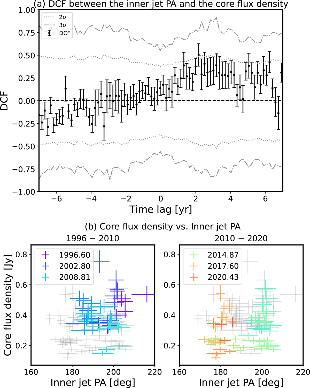
(a) DCF analysis between the PA and the core flux density. The grey dotted and dash-dotted lines show the 2σ and 3σ significance levels, respectively. (b) Core flux density vs. inner jet PA plot. Each panel displays the data between 1996 and 2010 (left) and between 2010 and 2025 (right). We use changing colors to show the time sequence: grey denotes the values from all observing epochs, purple to dark blue to clear blue denotes the data observed between 1996, 2002, and 2010, while green to orange to red between 2010, 2017, and 2020.
Current usage metrics show cumulative count of Article Views (full-text article views including HTML views, PDF and ePub downloads, according to the available data) and Abstracts Views on Vision4Press platform.
Data correspond to usage on the plateform after 2015. The current usage metrics is available 48-96 hours after online publication and is updated daily on week days.
Initial download of the metrics may take a while.