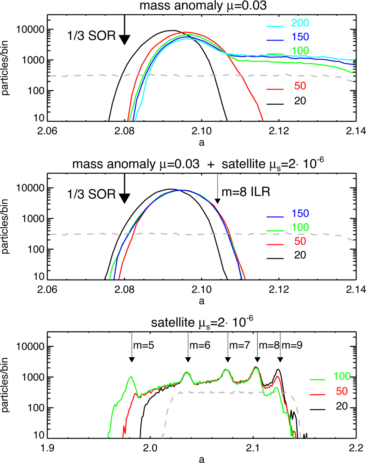
Fig. 18
Download original image
Comparison of the semimajor axis distributions in the three simulations of Figs. 17 and 19. The upper frame is the run with mass anomaly, and the colors indicate profiles at various times T = 20 000 to 200 000. The dashed gray line is the initial distribution, and the arrow marks the 1/3 SOR location. We note the growing tail of the distribution in profiles for T ≳ 100 000. In the middle frame, the simulation includes both the mass anomaly and a satellite. The run extends to T = 150 000 revolutions, with no leakage or spreading of the ringlet. The bottom frame shows the simulation with a satellite alone, with arrows marking its inner Lindblad resonances. We note the inward spreading of the ring and the gradual accumulation of material to the m = 5 resonance, and the disappearance of the m = 9 peak.
Current usage metrics show cumulative count of Article Views (full-text article views including HTML views, PDF and ePub downloads, according to the available data) and Abstracts Views on Vision4Press platform.
Data correspond to usage on the plateform after 2015. The current usage metrics is available 48-96 hours after online publication and is updated daily on week days.
Initial download of the metrics may take a while.