Fig. 5
Download original image
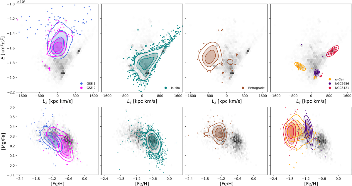
Top: Lindblad diagram for all clusters identified in this work. All stars are shown in gray (hexbin), while clusters are overplotted using a 2D Gaussian KDE. The three highest-density (60, 80, and 100%) levels are shown with filled contours, and stars outside these regions are plotted as scatter points to highlight lower-density members and outliers. Bottom: [Mg/Fe] vs. [Fe/H] abundance plane for the same clusters, using the same criteria for the density contours.
Current usage metrics show cumulative count of Article Views (full-text article views including HTML views, PDF and ePub downloads, according to the available data) and Abstracts Views on Vision4Press platform.
Data correspond to usage on the plateform after 2015. The current usage metrics is available 48-96 hours after online publication and is updated daily on week days.
Initial download of the metrics may take a while.