Fig. 3
Download original image
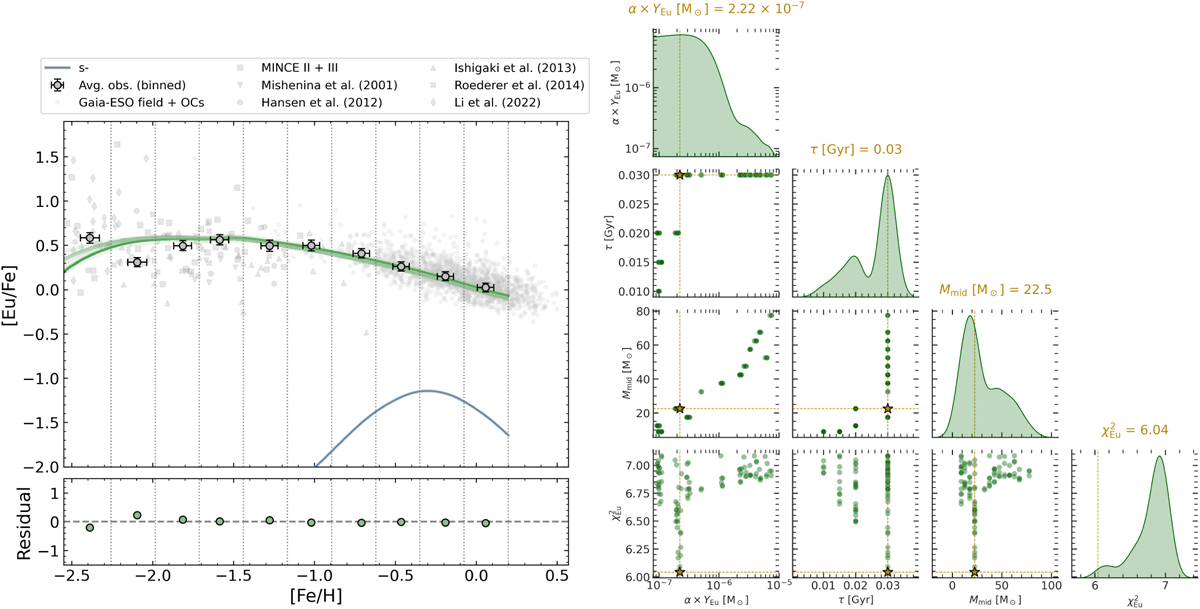
Left panel: observed and predicted [Eu/Fe] vs. [Fe/H] trends. Grey circles with error bars show the average observational values in metallicity bins. The solid green curve shows the predicted [Eu/Fe] vs. [Fe/H] trend for the best-fitting model, while the surrounding lighter green lines represent the range spanned by models within the top 100, providing an indication of the model uncertainty. The lower blue line represents the result of the model in case there is only the s-process contribution. The bottom panel shows the residuals between the binned observations and the model. Right panel: corner plot showing the marginal distributions (diagonal panels) and pairwise correlations (off-diagonal panels) of the parameters (YEu,r, α, [Ml, Mu], τ) for the 100 models with the lowest ![]() . Dashed yellow lines indicate the values of the best-fitting model, with the corresponding numerical values reported above each marginal distribution, and the yellow star marks its position in each correlation plot.
. Dashed yellow lines indicate the values of the best-fitting model, with the corresponding numerical values reported above each marginal distribution, and the yellow star marks its position in each correlation plot.
Current usage metrics show cumulative count of Article Views (full-text article views including HTML views, PDF and ePub downloads, according to the available data) and Abstracts Views on Vision4Press platform.
Data correspond to usage on the plateform after 2015. The current usage metrics is available 48-96 hours after online publication and is updated daily on week days.
Initial download of the metrics may take a while.