Fig. 6
Download original image
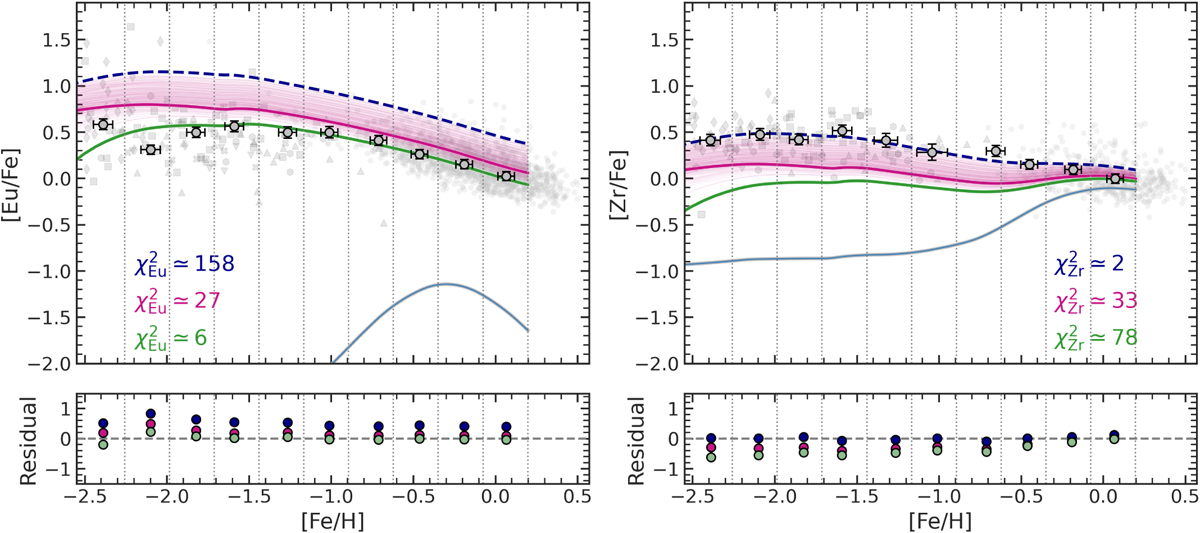
Comparison between observed [Eu/Fe] and [Zr/Fe] vs. [Fe/H] trends and the predictions of the Pareto optimal models (magenta lines). The thicker magenta lines show the predicted [Eu/Fe] and [Zr/Fe] vs. [Fe/H] trends for the Pareto optimal model with the smallest distance to the ideal point (0, 0) in objective space. The solid green curve shows the best-fit model to Eu and its corresponding prediction for Zr, while the dashed blue line represents the best-fit model to Zr and its prediction for Eu. The lower light blue lines represent the results of the model in case there is only the s-process contribution. Grey circles with error bars show the average observational values in metallicity bins. Residuals relative to the binned observations are displayed in the lower panels. Symbols for the observational data are the same as in Figure 3.
Current usage metrics show cumulative count of Article Views (full-text article views including HTML views, PDF and ePub downloads, according to the available data) and Abstracts Views on Vision4Press platform.
Data correspond to usage on the plateform after 2015. The current usage metrics is available 48-96 hours after online publication and is updated daily on week days.
Initial download of the metrics may take a while.