Fig. A.4
Download original image
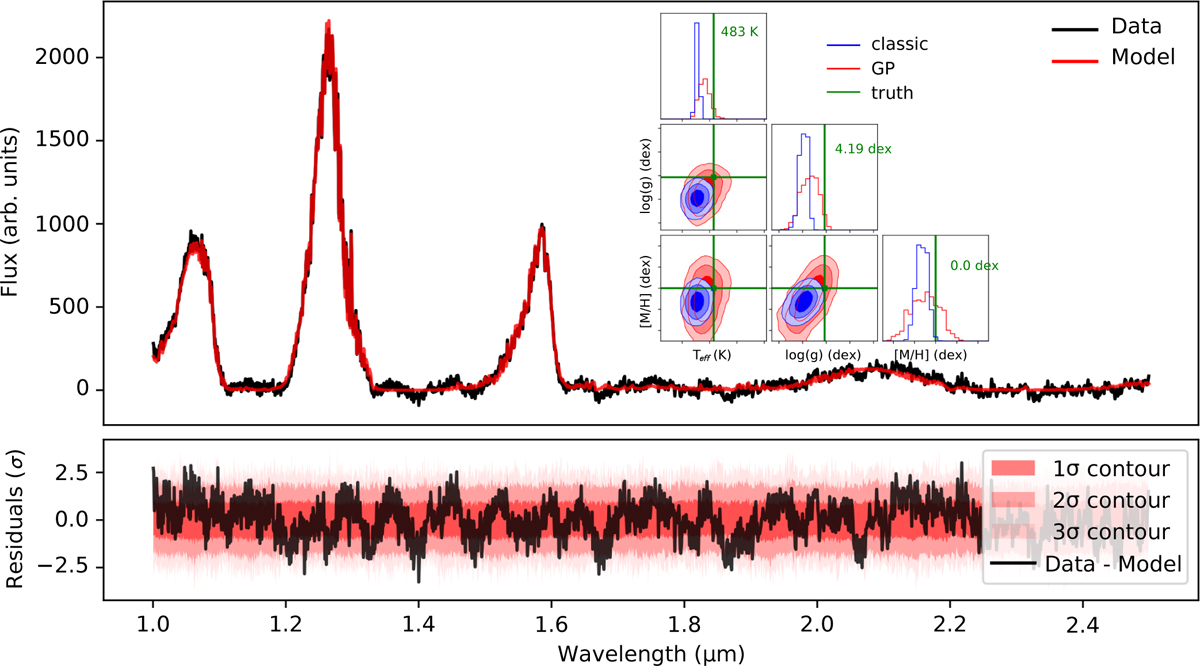
Injection test summary figure. Top panel: Comparison between the mock spectrum (black) and the fitted GP-aided model (red). Top subpanel: Corner plot of the grid parameters from the inversions with (red) and without (blue) GP. Green lines indicate the injected values. Bottom panel: Normalized residuals between the mock data and the fitted GP-aided model (black). Shaded regions represent the 1σ, 2σ, and 3σ dispersions from 200 random draws from the covariance matrix C.
Current usage metrics show cumulative count of Article Views (full-text article views including HTML views, PDF and ePub downloads, according to the available data) and Abstracts Views on Vision4Press platform.
Data correspond to usage on the plateform after 2015. The current usage metrics is available 48-96 hours after online publication and is updated daily on week days.
Initial download of the metrics may take a while.