Fig. 2
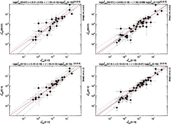
Upper panels: soft (0.3–0.7 keV) vs. hard (2–10 keV)  , computed within the 80 ks (left), and 40 ks (right) intervals. Lower panels: similar plots for in the 0.7–2 vs. in the 2–10 keV band. The best fit curves are plotted with solid lines and the combined 1-σ error on the slope and normalisation with dotted lines. The red dashed lines represents the one to one relations expected in the case of achromatic variations. On top of each panel (in this and all similar subsequent figures) we report the best fit models (see also Table 5).
Current usage metrics show cumulative count of Article Views (full-text article views including HTML views, PDF and ePub downloads, according to the available data) and Abstracts Views on Vision4Press platform.
Data correspond to usage on the plateform after 2015. The current usage metrics is available 48-96 hours after online publication and is updated daily on week days.
Initial download of the metrics may take a while.