Fig. 11.
Download original image
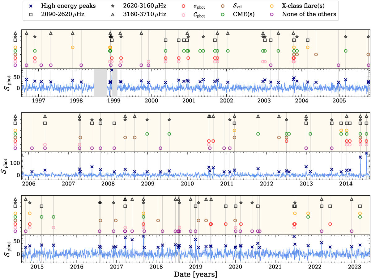
𝒮phot is shown in light blue in the lower part of each panel, along with the detected high-energy peaks marked by dark blue crosses. For better clarity, the full 27-year time series is divided into three panels (from top to bottom). For each peak, when it corresponds to a peak in σphot (resp. in 𝒞phot or in 𝒮vel), within a window of δt = 1.45 days, a red (resp. pink or brown) circle highlights it in the top light beige area of each panel. Similarly, when at least one X-class flare (or one CME) occurred within the δt-window around the peak, it is marked by an orange (or green) circle. Peaks not coinciding with any of these events are marked by violet circles. Furthermore, if a peak is detected within one of the three defined frequency bands, it is highlighted with a black marker: a square for low frequencies, a star for medium frequencies, and a triangle for high frequencies. Gaps due to the SoHO recovery mission are represented as grey shaded areas. Minor ticks represent months.
Current usage metrics show cumulative count of Article Views (full-text article views including HTML views, PDF and ePub downloads, according to the available data) and Abstracts Views on Vision4Press platform.
Data correspond to usage on the plateform after 2015. The current usage metrics is available 48-96 hours after online publication and is updated daily on week days.
Initial download of the metrics may take a while.