Fig. 6.
Download original image
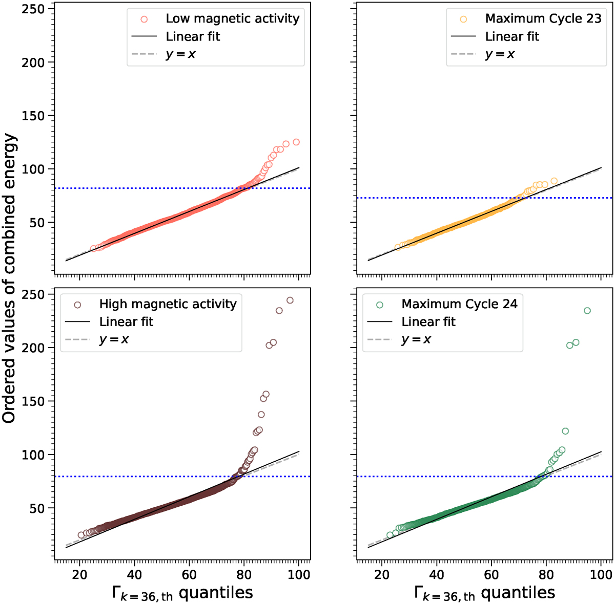
Q-Q plot comparing the combined energy time series with ![]() distributions. Panels correspond to the 4 selected sub-samples: low magnetic activity (in pink, top left), high magnetic activity (in brown, bottom left), maximum of cycle 23 (in yellow, top right) and maximum of cycle 24 (in green, bottom right). The general trend of the Q-Q plot was fitted with a least square regression to the data and is shown as a black line on all panels. The grey dashed line shows the line y = x, and the blue dotted line shows the value of the quantile at 98% for each period.
distributions. Panels correspond to the 4 selected sub-samples: low magnetic activity (in pink, top left), high magnetic activity (in brown, bottom left), maximum of cycle 23 (in yellow, top right) and maximum of cycle 24 (in green, bottom right). The general trend of the Q-Q plot was fitted with a least square regression to the data and is shown as a black line on all panels. The grey dashed line shows the line y = x, and the blue dotted line shows the value of the quantile at 98% for each period.
Current usage metrics show cumulative count of Article Views (full-text article views including HTML views, PDF and ePub downloads, according to the available data) and Abstracts Views on Vision4Press platform.
Data correspond to usage on the plateform after 2015. The current usage metrics is available 48-96 hours after online publication and is updated daily on week days.
Initial download of the metrics may take a while.