Fig. 7.
Download original image
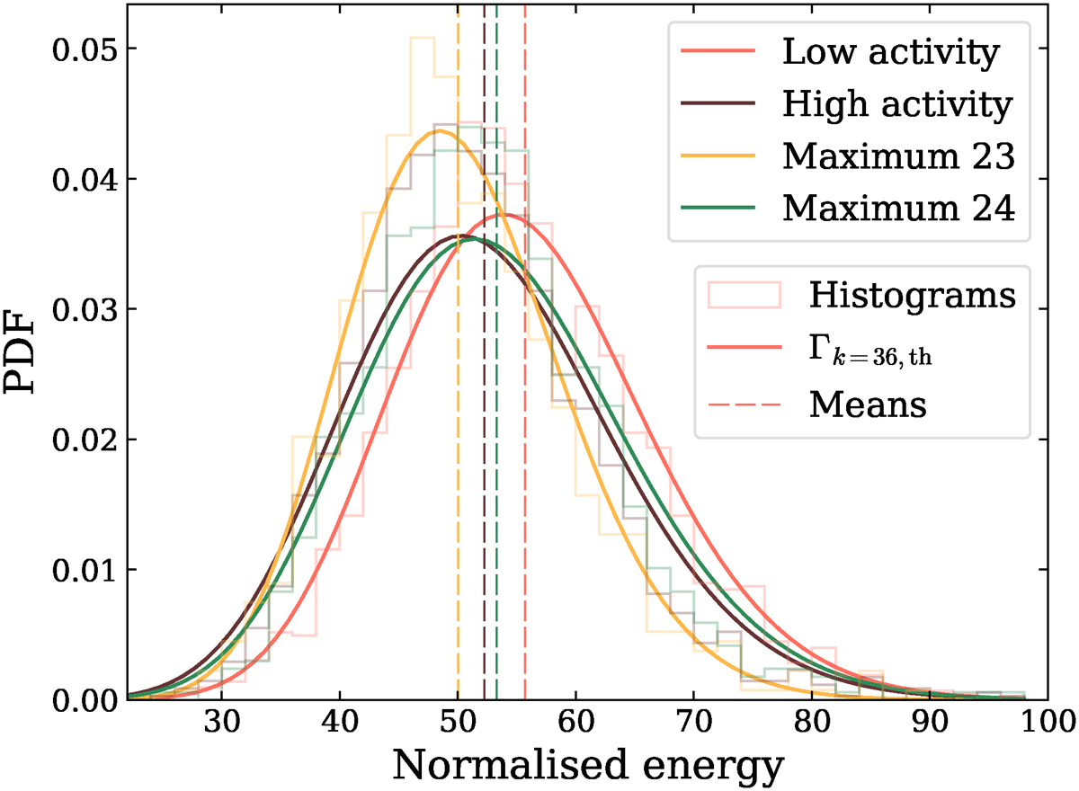
Distributions of normalised combined energies. For each cycle period, we show the histogram, the best ![]() distribution in continuous line and its mean in dashed line. Red data correspond to low magnetic activity, the brown ones to high activity, the yellow ones to the maximum of cycle 23, and the green ones to the maximum of cycle 24.
distribution in continuous line and its mean in dashed line. Red data correspond to low magnetic activity, the brown ones to high activity, the yellow ones to the maximum of cycle 23, and the green ones to the maximum of cycle 24.
Current usage metrics show cumulative count of Article Views (full-text article views including HTML views, PDF and ePub downloads, according to the available data) and Abstracts Views on Vision4Press platform.
Data correspond to usage on the plateform after 2015. The current usage metrics is available 48-96 hours after online publication and is updated daily on week days.
Initial download of the metrics may take a while.