Fig. B.1.
Download original image
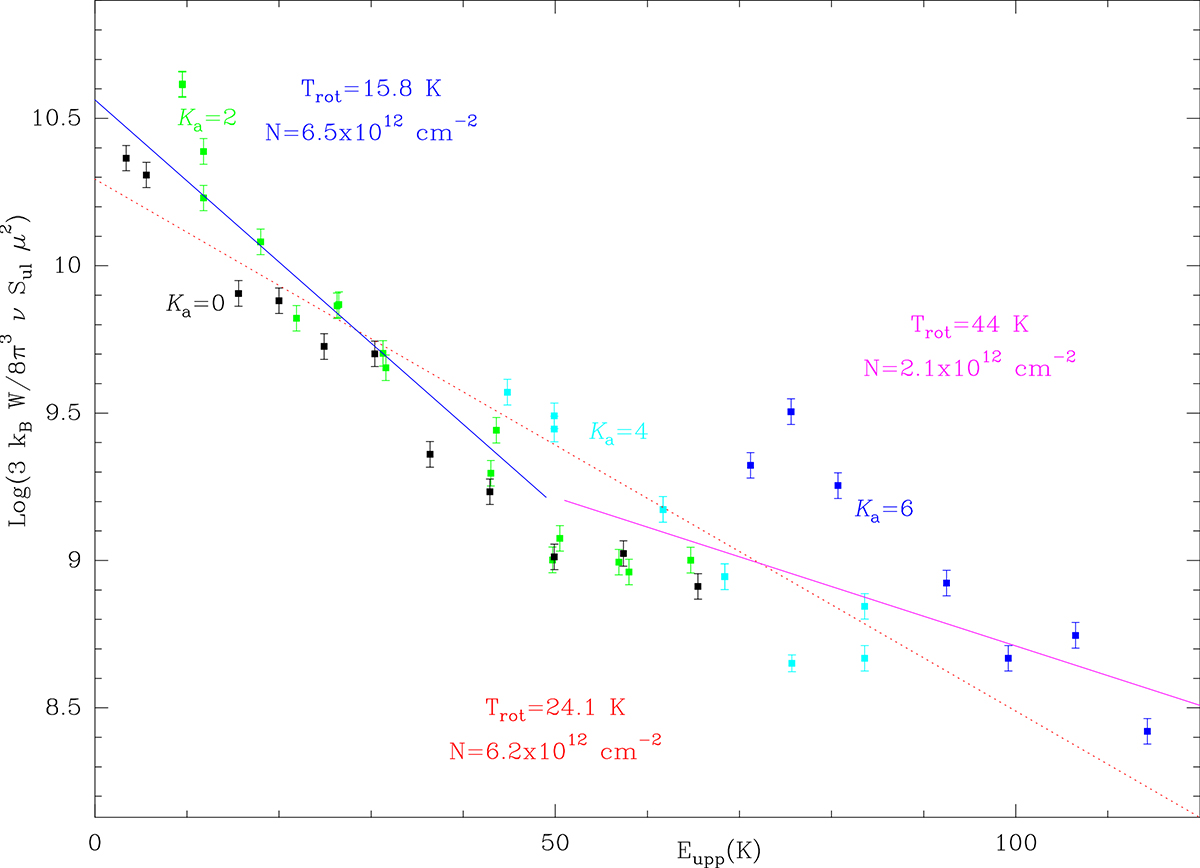
Rotational diagram for the lines of r-SiC3. The blue line correspond to a fit to all transitions with energy of their upper level lower than 50 K. The purple one corresponds to the fit to all data with upper level energies above 50 K. The dashed red line corresponds to a global fit to all the data and represents an averaged temperature and column density. The data for each Ka is represented by the same color (black for Ka = 0, green for Ka = 2, cyan for Ka = 4 and blue for Ka = 6.
Current usage metrics show cumulative count of Article Views (full-text article views including HTML views, PDF and ePub downloads, according to the available data) and Abstracts Views on Vision4Press platform.
Data correspond to usage on the plateform after 2015. The current usage metrics is available 48-96 hours after online publication and is updated daily on week days.
Initial download of the metrics may take a while.