Fig. 4.
Download original image
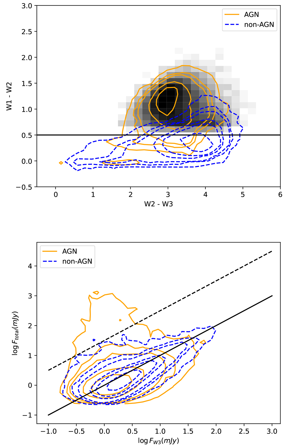
Top panel: WISE color-color diagram for prediction set. The horizontal line presents the simple W1 − W2 criterion to select AGNs, while the gray density plots show the sources satisfying the criterion combining W1 − W2 color and W2mag (see the text for details). Bottom panel: Radio/MIR flux diagram for prediction set. The solid line shows the one-to-one correlation. The dashed line presents a division line to identify radio/MIR excess. For both panels, the orange contours represent AGNs. The levels of the contours are [10, 50, 100, 500, and 1000]. The blue contours represent non-AGNs. The levels of the contours are [10, 50, 100, 500, 1000, and 3000].
Current usage metrics show cumulative count of Article Views (full-text article views including HTML views, PDF and ePub downloads, according to the available data) and Abstracts Views on Vision4Press platform.
Data correspond to usage on the plateform after 2015. The current usage metrics is available 48-96 hours after online publication and is updated daily on week days.
Initial download of the metrics may take a while.