Fig. 4
Download original image
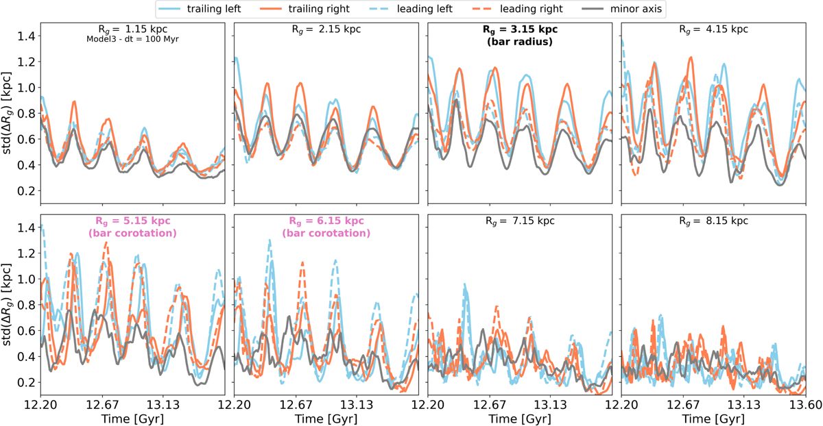
Time evolution of migration strength from different galactic disk radii in Model3. In each panel, the different curves correspond to the migration strength (i.e., how far stars found in this region at some time, t, migrate after ∆t) of stars originally found in each of the squares shown in Fig. 1. Light blue and orange indicate the left and right sides of the bar, respectively, while solid and dashed represent the trailing and leading sides of the bar, respectively. The gray curve is the mean migration strength along the bar minor axis (i.e., the two gray squares of Fig. 1). From left to right, these squares are shifted horizontally (light blue and orange) and vertically (gray), along the bar major and minor axis, respectively, to probe different radii.
Current usage metrics show cumulative count of Article Views (full-text article views including HTML views, PDF and ePub downloads, according to the available data) and Abstracts Views on Vision4Press platform.
Data correspond to usage on the plateform after 2015. The current usage metrics is available 48-96 hours after online publication and is updated daily on week days.
Initial download of the metrics may take a while.