Fig. 5
Download original image
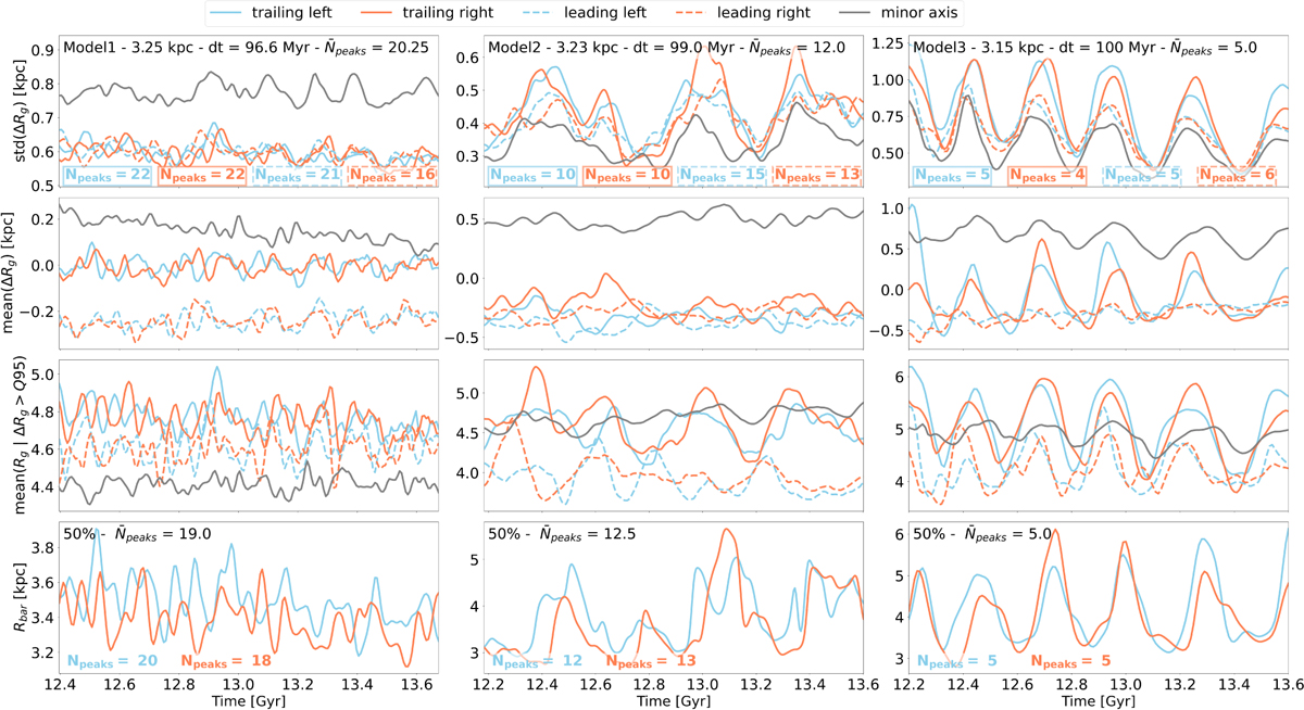
Time evolution of different migration statistics compared to bar length time evolution, for the three models (from left to right). Different azimuths around the bar radius are scanned using the six 2 × 2 kpc2 square regions shown in Fig. 1. The gray curve is the mean statistical quantity over the two squares placed along the bar minor axis. Again, blue and orange curves represent the left and right sides of the bar, respectively, while solid and dashed lines stand for the leading and trailing sides of the bar, respectively. The number of peaks of these curves is indicated as N̄peaks in the top and bottom panel; N̄peaks is the mean Npeaks over the different curves. First row: standard deviation of the change in guiding radius over ∆t = 100 Myr experienced by all stars located in the six different square-shaped regions. Second row: same as top row, but for the mean change in guiding radius, which slows the net angular momentum transfer. Third row: mean guiding radius after ∆t = 100 Myr for the 5% stars that migrate the most. Last row: time evolution of the bar half-length. The peaks correspond to moments when the bar is connected to a spiral arm. The maxima in the migration strength, or their frequency, coincide with those of the bar half-length, which indicates that they are a result of the interaction between the bar and spiral arms.
Current usage metrics show cumulative count of Article Views (full-text article views including HTML views, PDF and ePub downloads, according to the available data) and Abstracts Views on Vision4Press platform.
Data correspond to usage on the plateform after 2015. The current usage metrics is available 48-96 hours after online publication and is updated daily on week days.
Initial download of the metrics may take a while.