Fig. 2.
Download original image
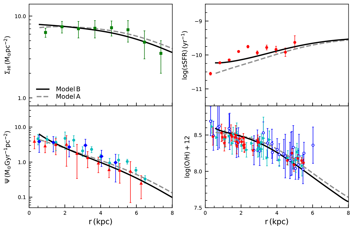
Comparisons between model predictions and observed data of NGC 300. The solid lines correspond to the best-fitting model with a radial inflow of gas (Model B) and the dashed lines to the model without radial inflow (Model A). The left-hand side shows the radial profiles of HI (top) mass and SFR (bottom) surface density, while the right-hand side displays the radial profiles of sSFR (top) and 12 + log (O/H) (bottom). The HI data (see text) are shown by green filled squares. The SFR data are separately denoted as blue filled diamonds (Gogarten et al. 2010), red filled triangles (Williams et al. 2013), and cyan filled circles (Mondal et al. 2019). The sSFR data (see text) are plotted as red filled circles. The 12 + log(O/H) data from the HII regions (Bresolin et al. 2009), BSGs (Kudritzki et al. 2008), and RSGs (Gazak et al. 2015) are shown as red filled asterisks, blue open circles, and cyan filled triangles, respectively.
Current usage metrics show cumulative count of Article Views (full-text article views including HTML views, PDF and ePub downloads, according to the available data) and Abstracts Views on Vision4Press platform.
Data correspond to usage on the plateform after 2015. The current usage metrics is available 48-96 hours after online publication and is updated daily on week days.
Initial download of the metrics may take a while.